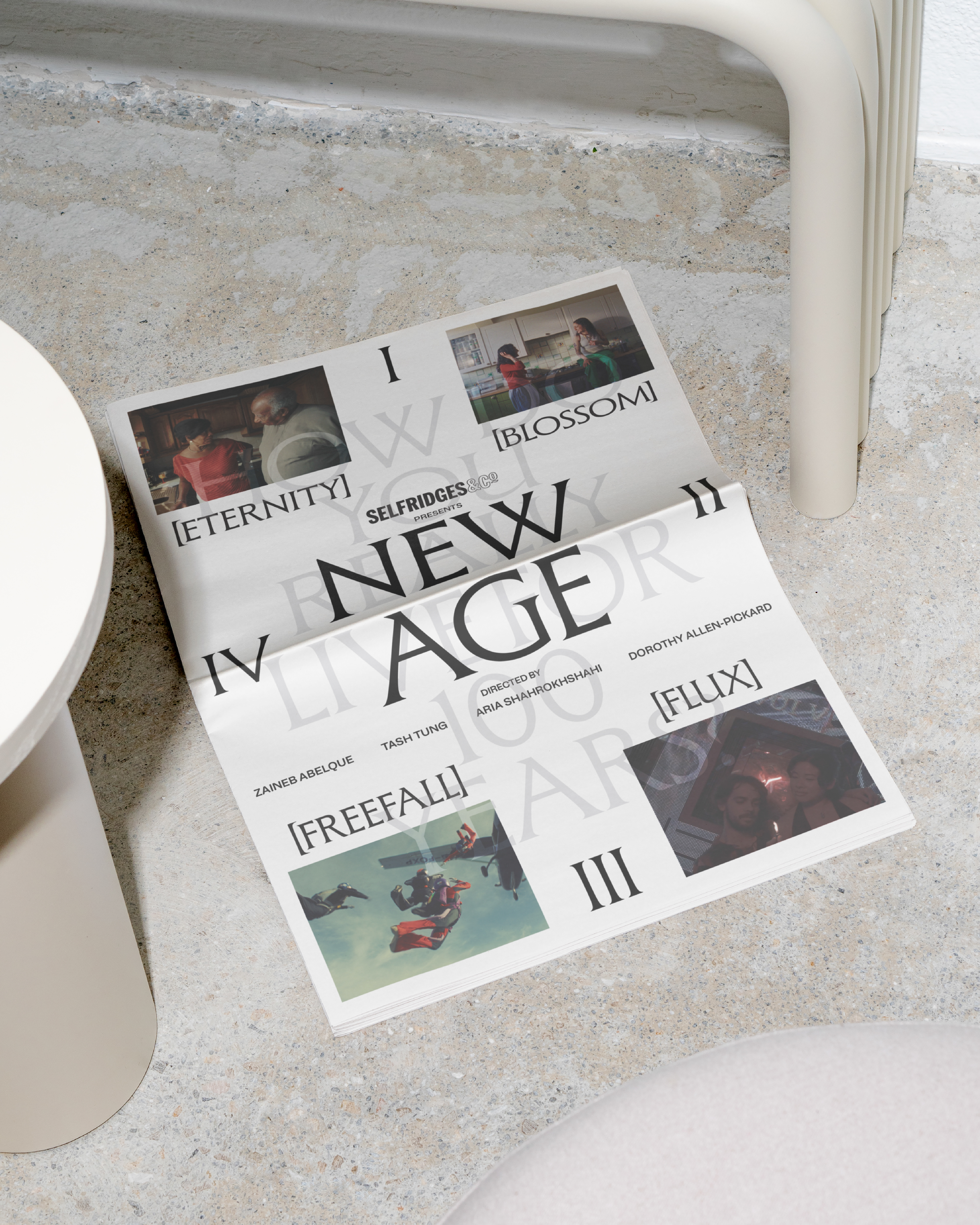
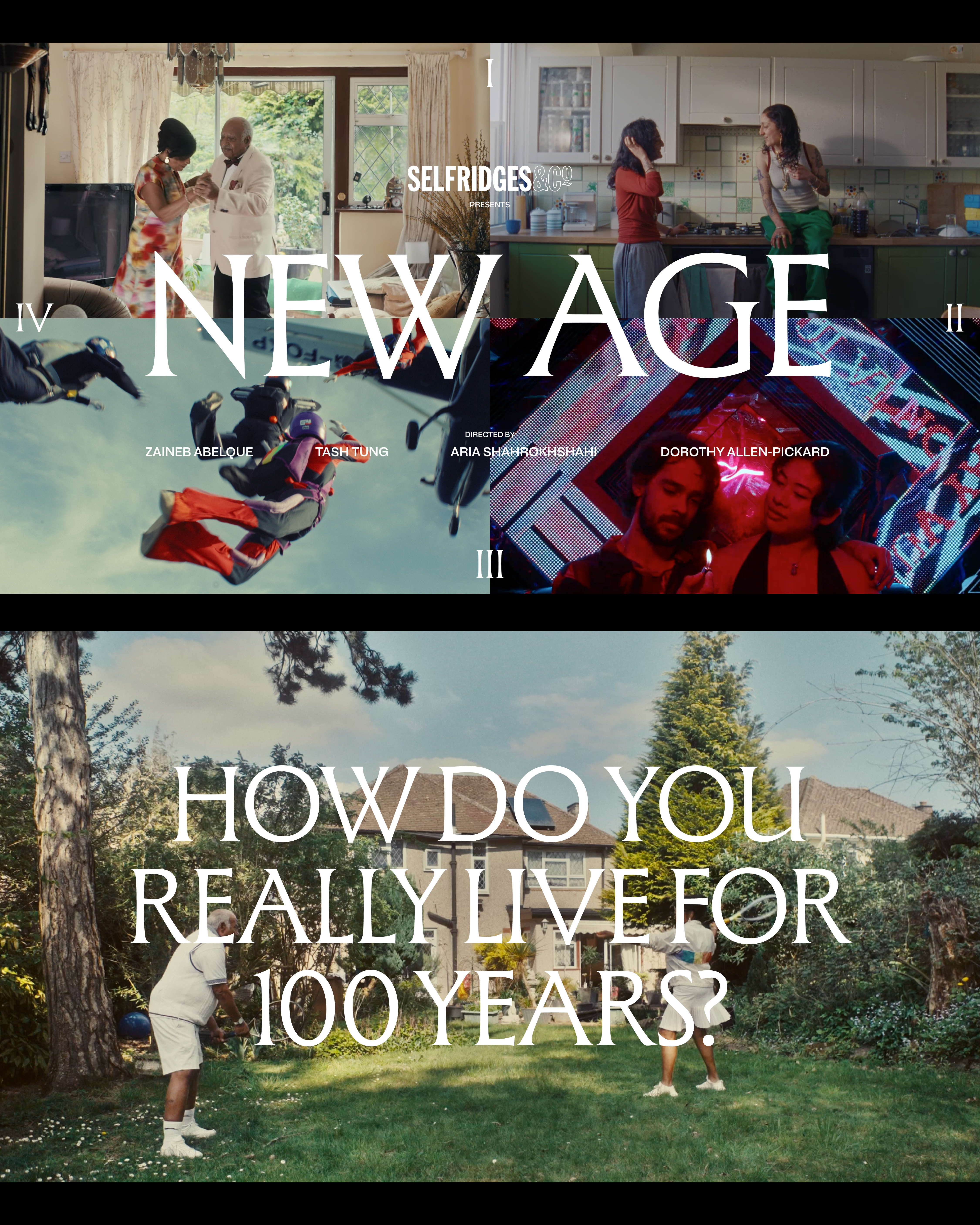
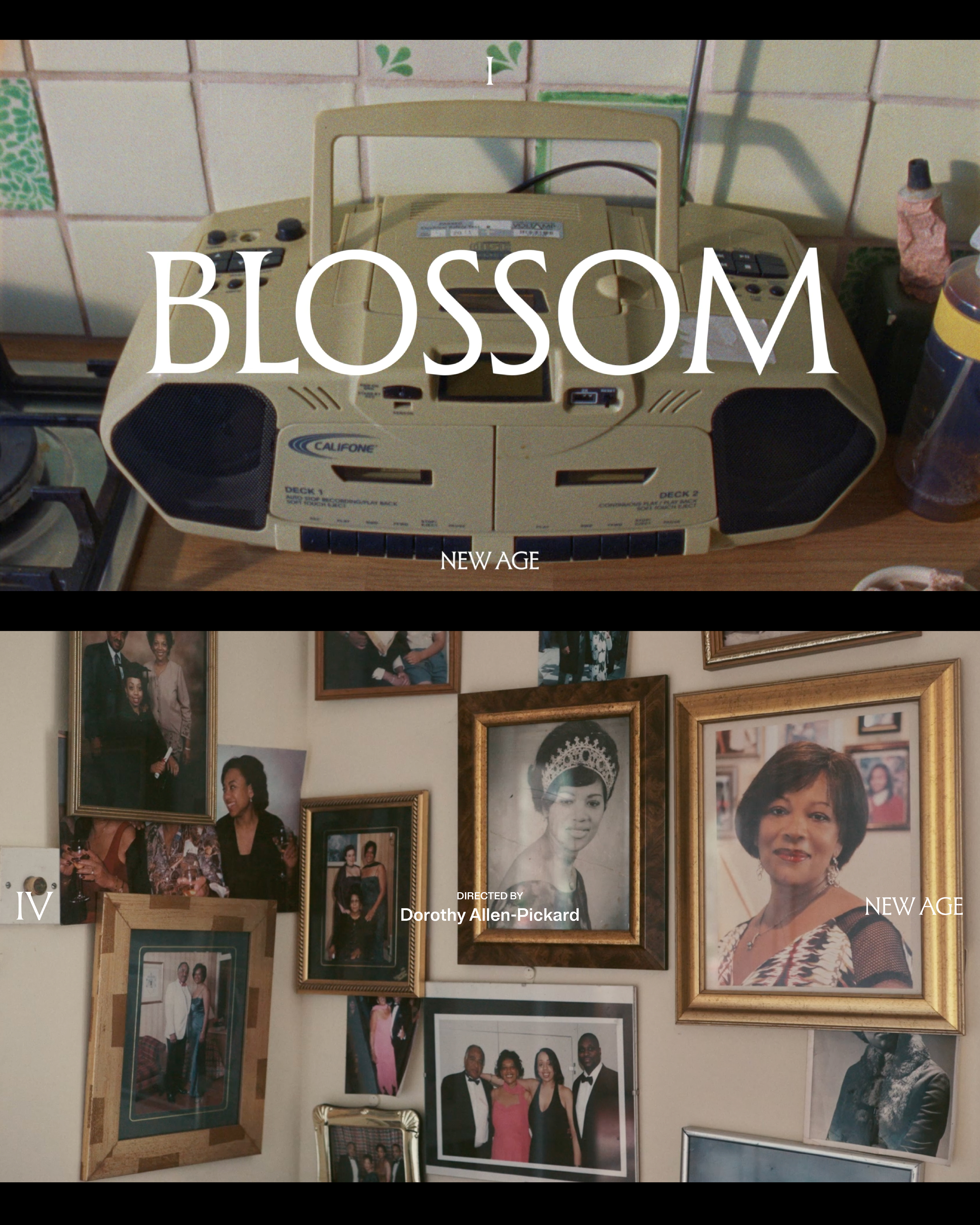
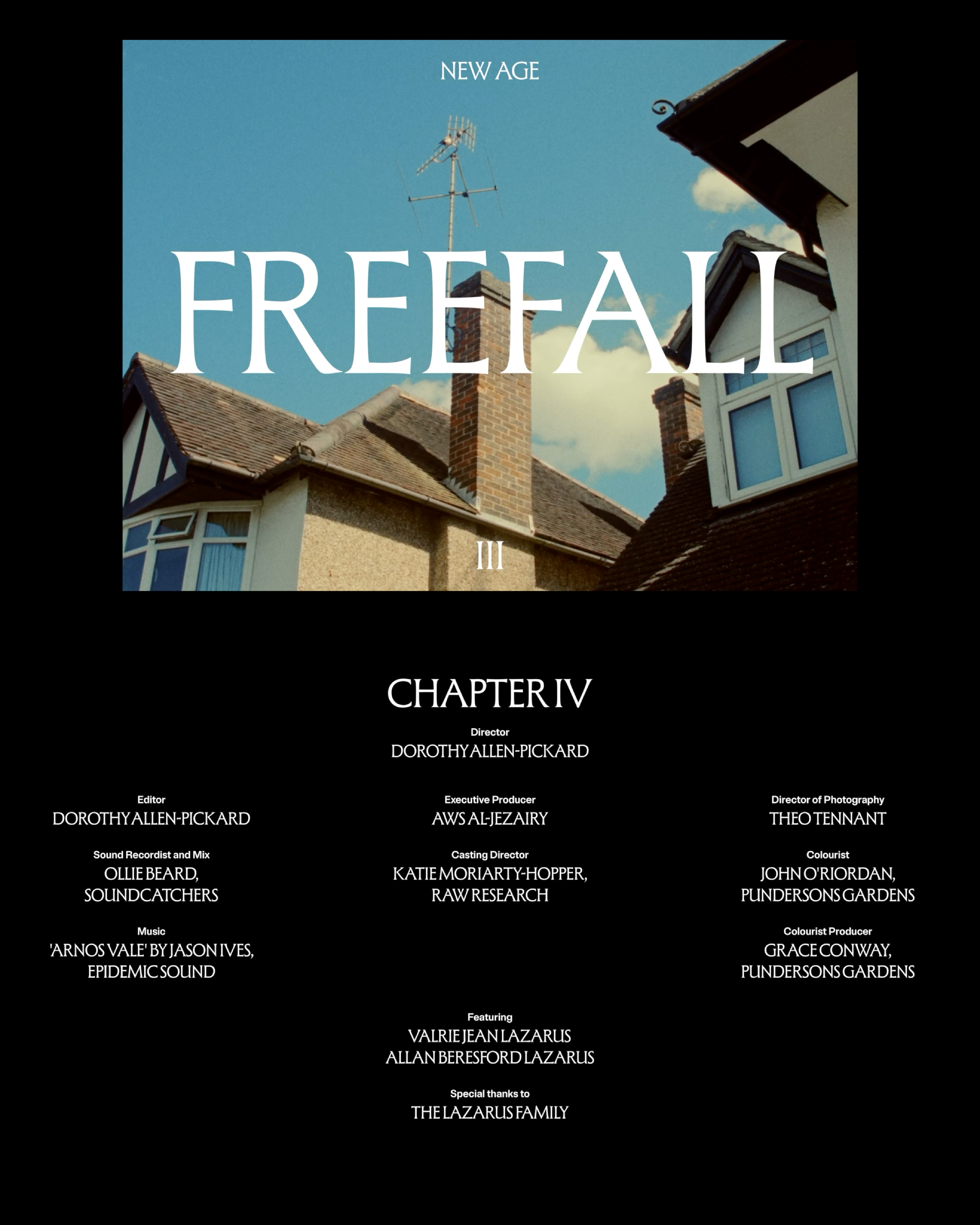
NEW AGE
New Age is a cinematic exploration of what it truly means to live for 100 years, celebrating the beauty of life through moments of growth, transformation, and enduring connection. Told in four chapters by directors Zaineb Abelque (Blossom), Tash Tung (Flux), Aria Shahrokhshahi (Freefall), and Dorothy Allen-Pickard (Eternity), the film weaves a visual chronicle of self-discovery across a century-long journey. The project’s visual identity- shaped through design direction, title design, and poster- unifies these chapters, capturing the essence of time, memory, and the pursuit of eternity.(Explore the film series here ->)


SELFRIDGES CELEBRATES 2025
[Creative Direction]Lovers, Mothers, Fathers, Family and Friends.
Each year, Selfridges commissions an illustrator to create artwork for its annual programme of celebrations. The project showcases creative expression at its most joyful- playful visual storytelling designed simply to delight the eye and mind.
In 2025, we collaborated with Fromm Studio to deliver campaign assets for the year-round programme. The work was rolled out across print graphics, digital platforms, visual merchandising, and store windows, translating the illustrated concept into a cohesive in-store and online experience.
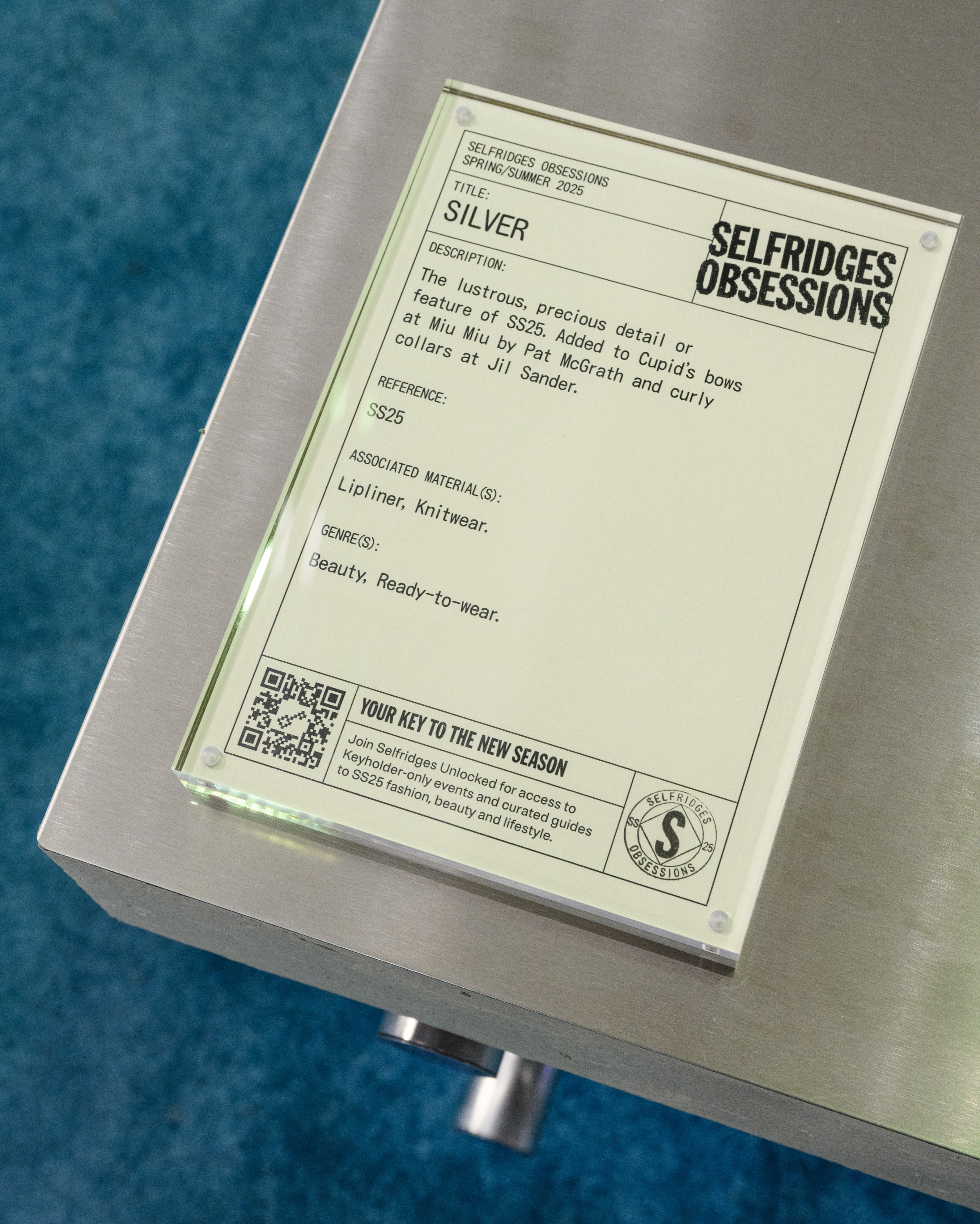

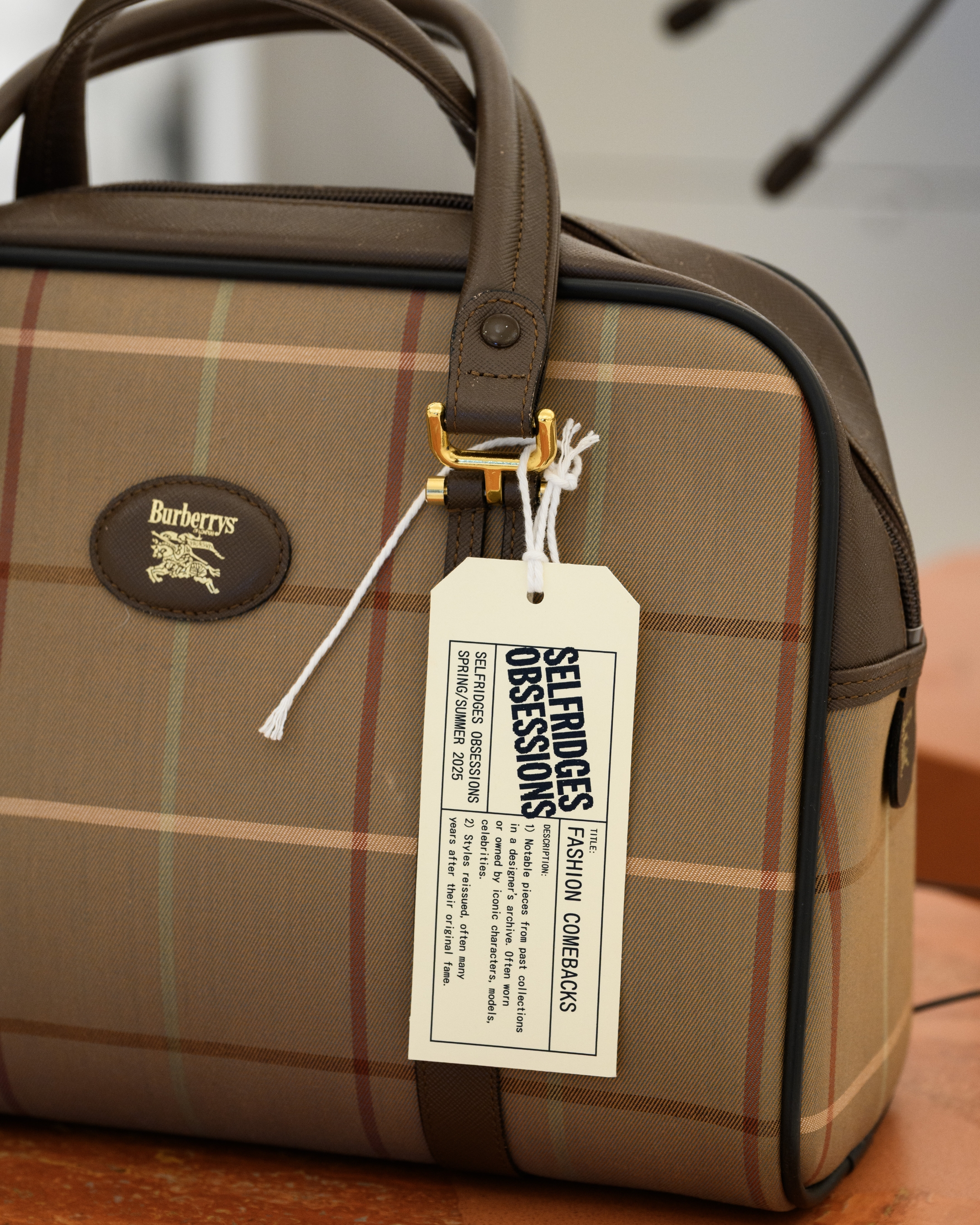
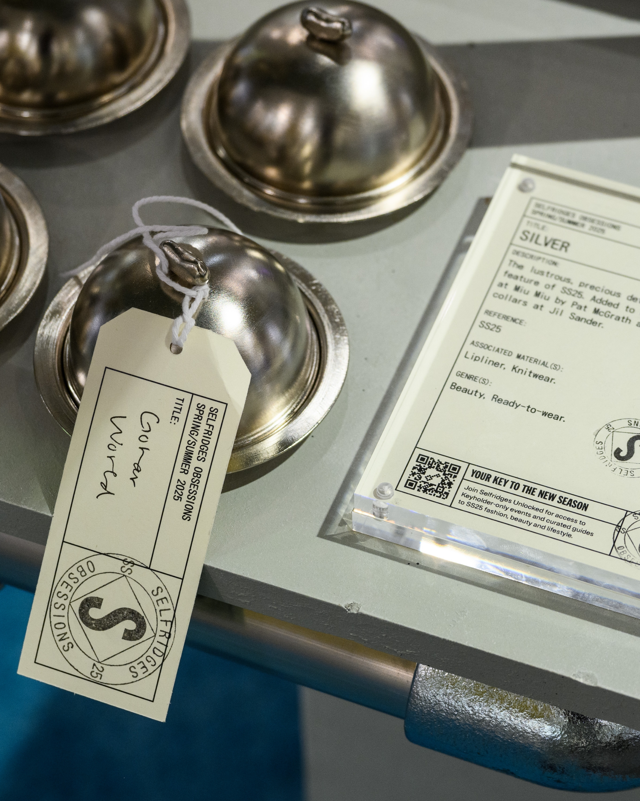

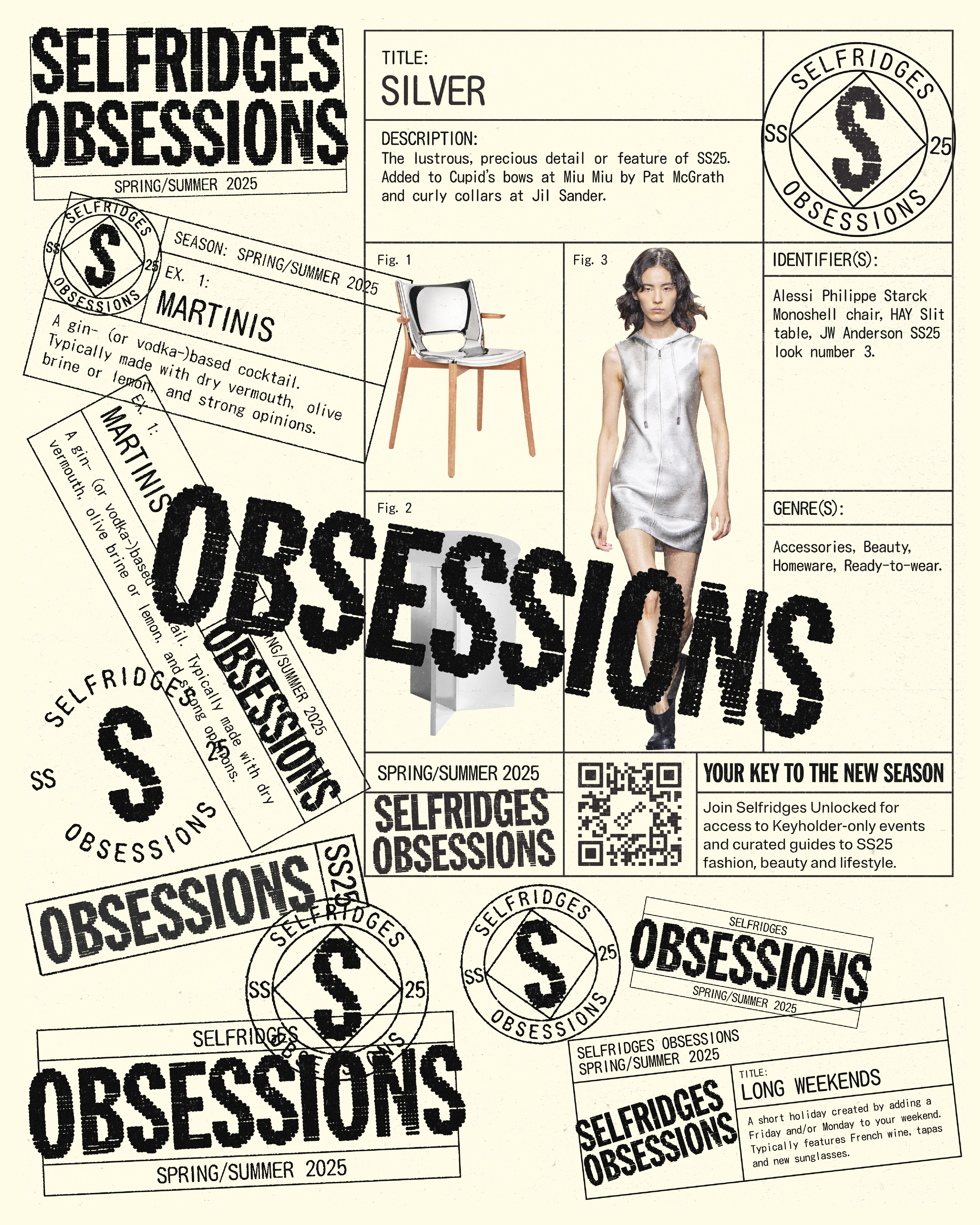
SELFRIDGES OBSESSIONS (SS25)
Selfridges Obsessions features a spectrum of Selfridges’s latest obsessions, niche or trending, of the moment or lifelong. 12 Selfridges Obsessions for SS25 include Chess, Long Weekends, Dogs, Hot Sauce, Matchsticks, Martinis, and more.The design identity is rooted in the concept of being certified obsessed. Stamp-like design elements translate the campaign through the visual language of collecting, documenting, certifying, and curating cultural fascinations. These motifs emphasise the ritualistic nature of obsession- marking each theme as a treasured find in Selfridges' ever-evolving archive of desire.

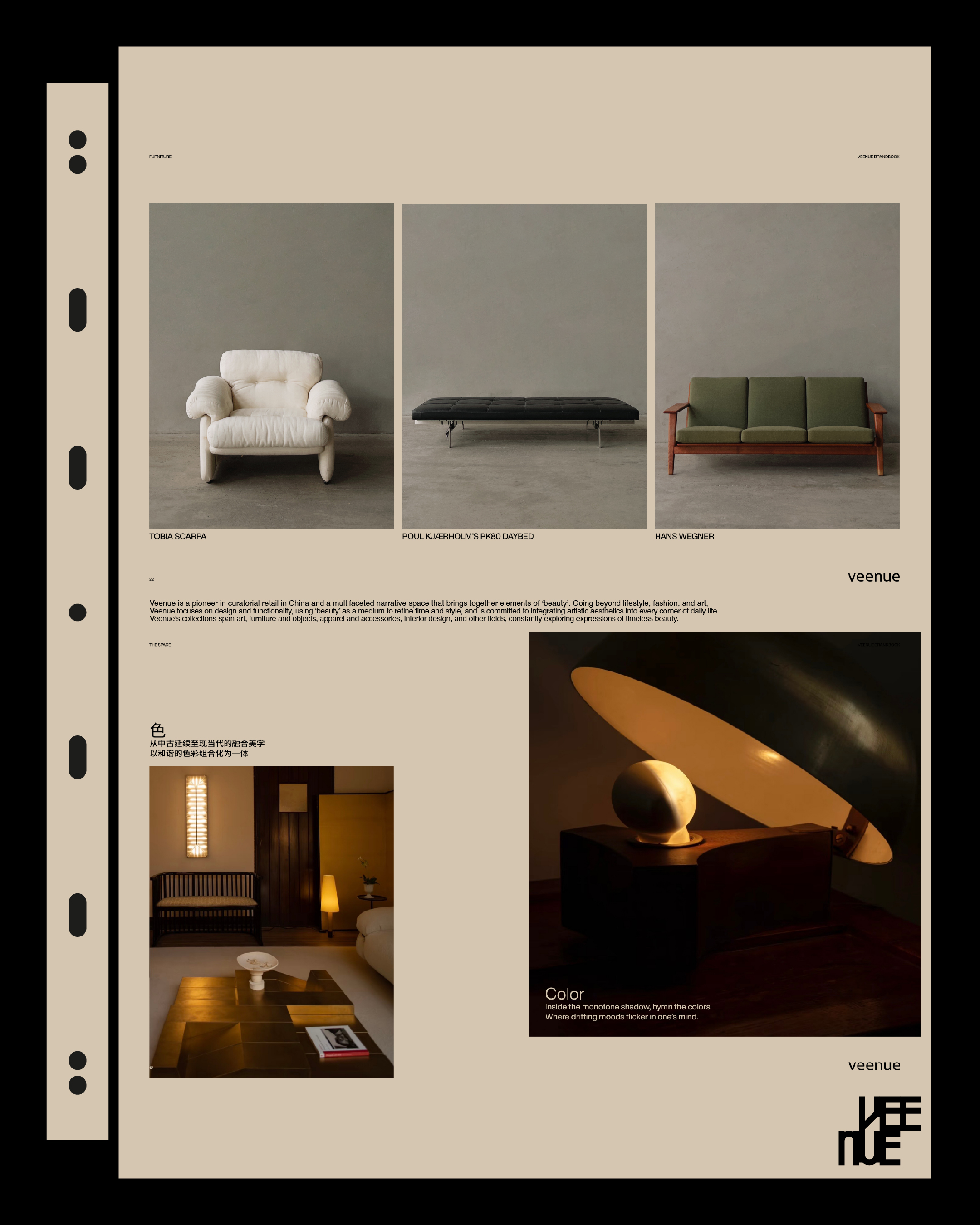

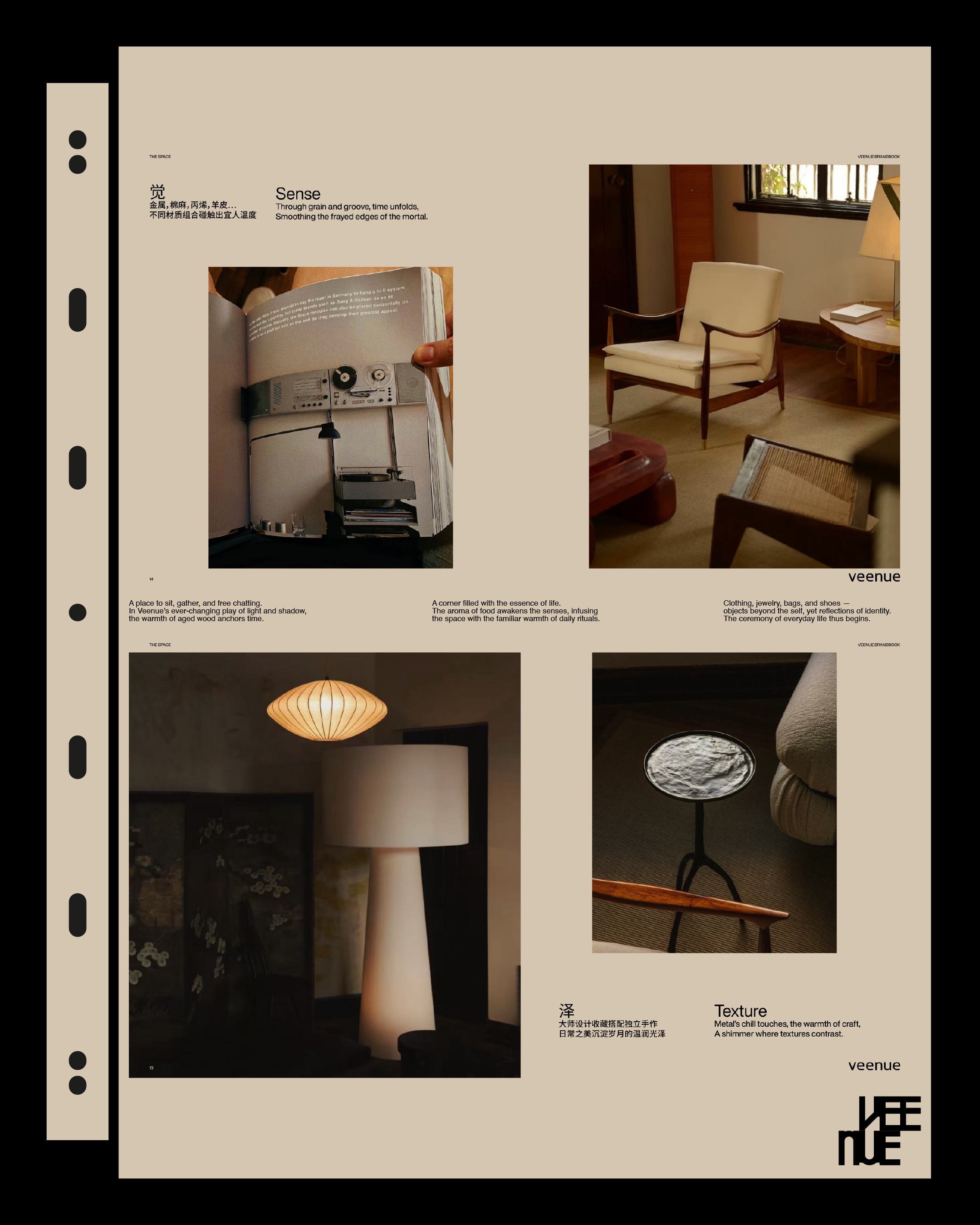
VEENUE BRANDBOOK
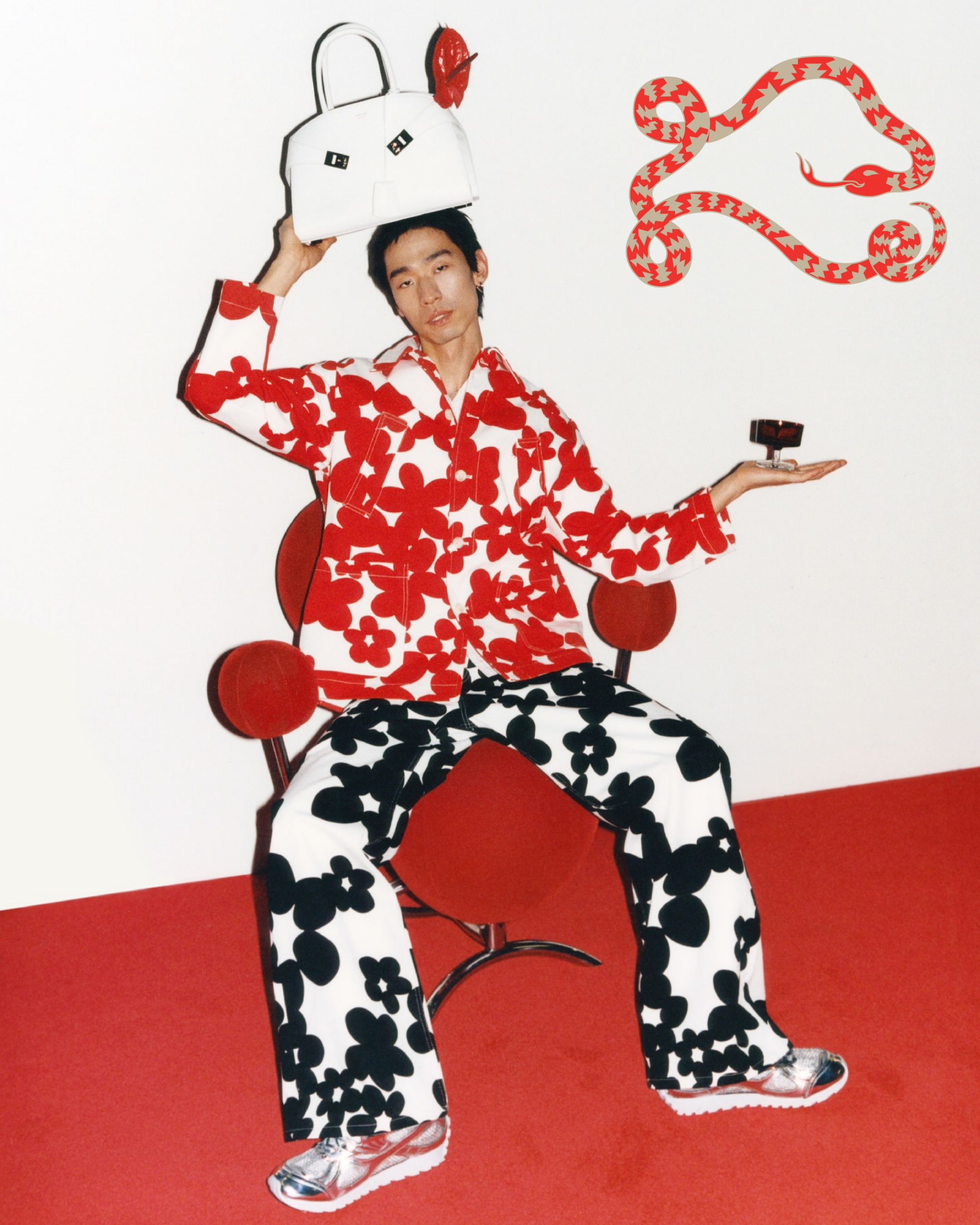
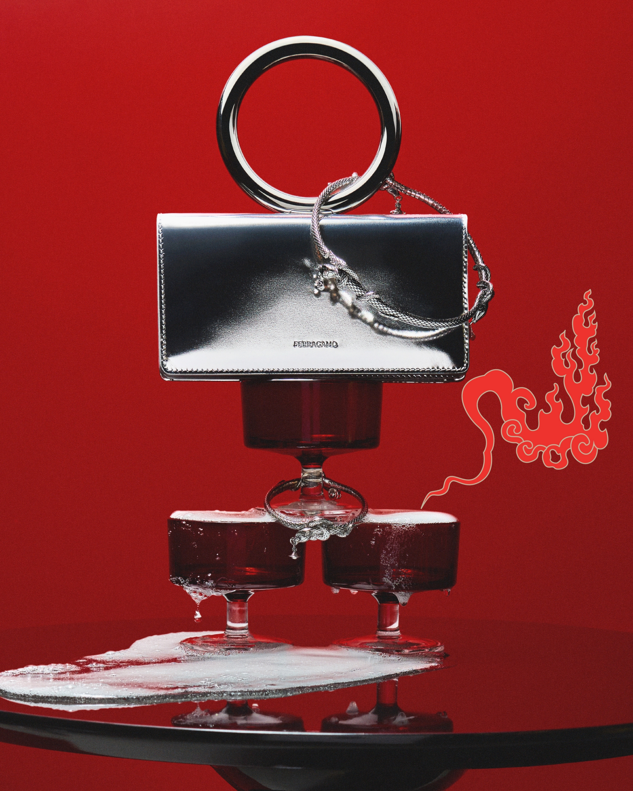

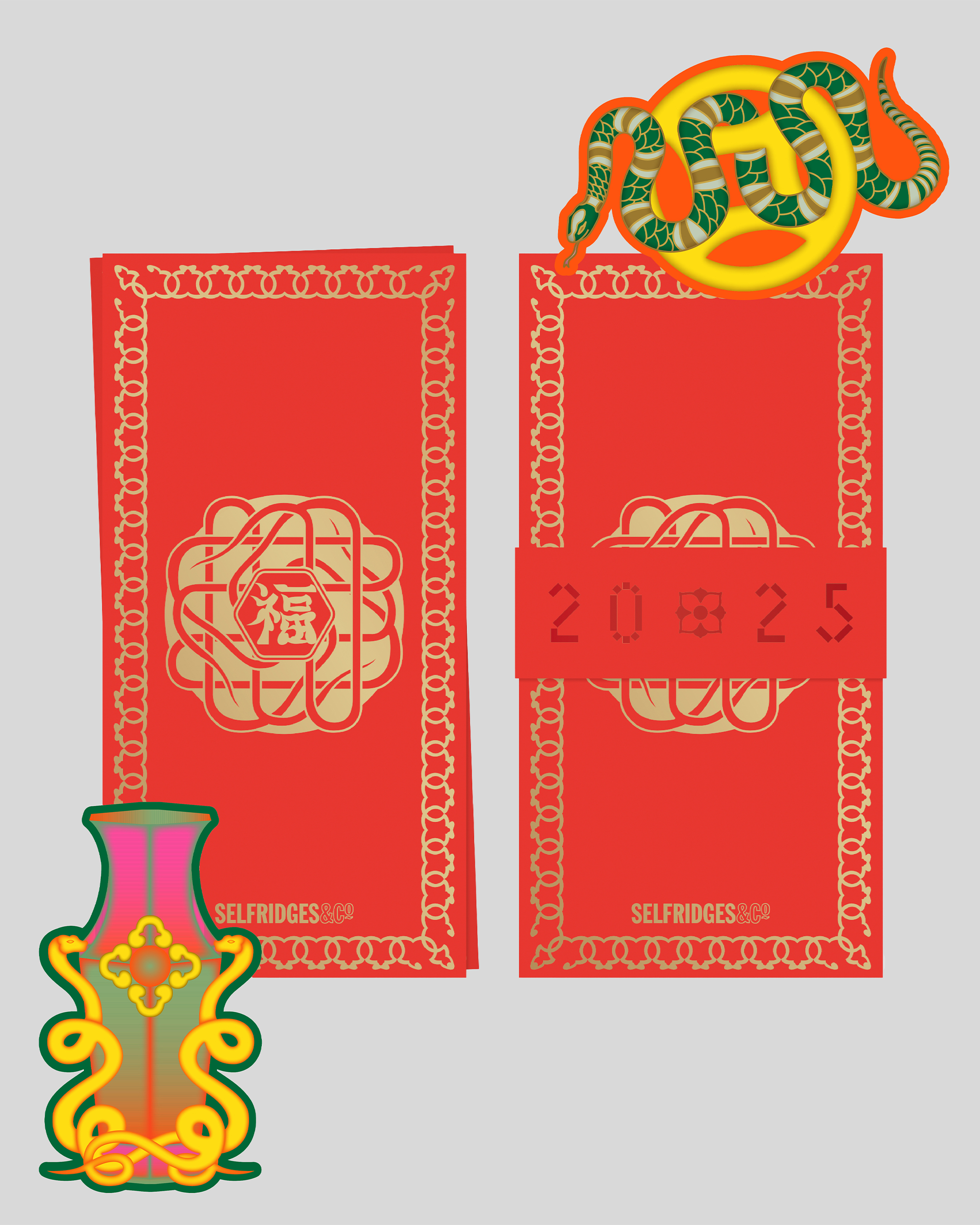
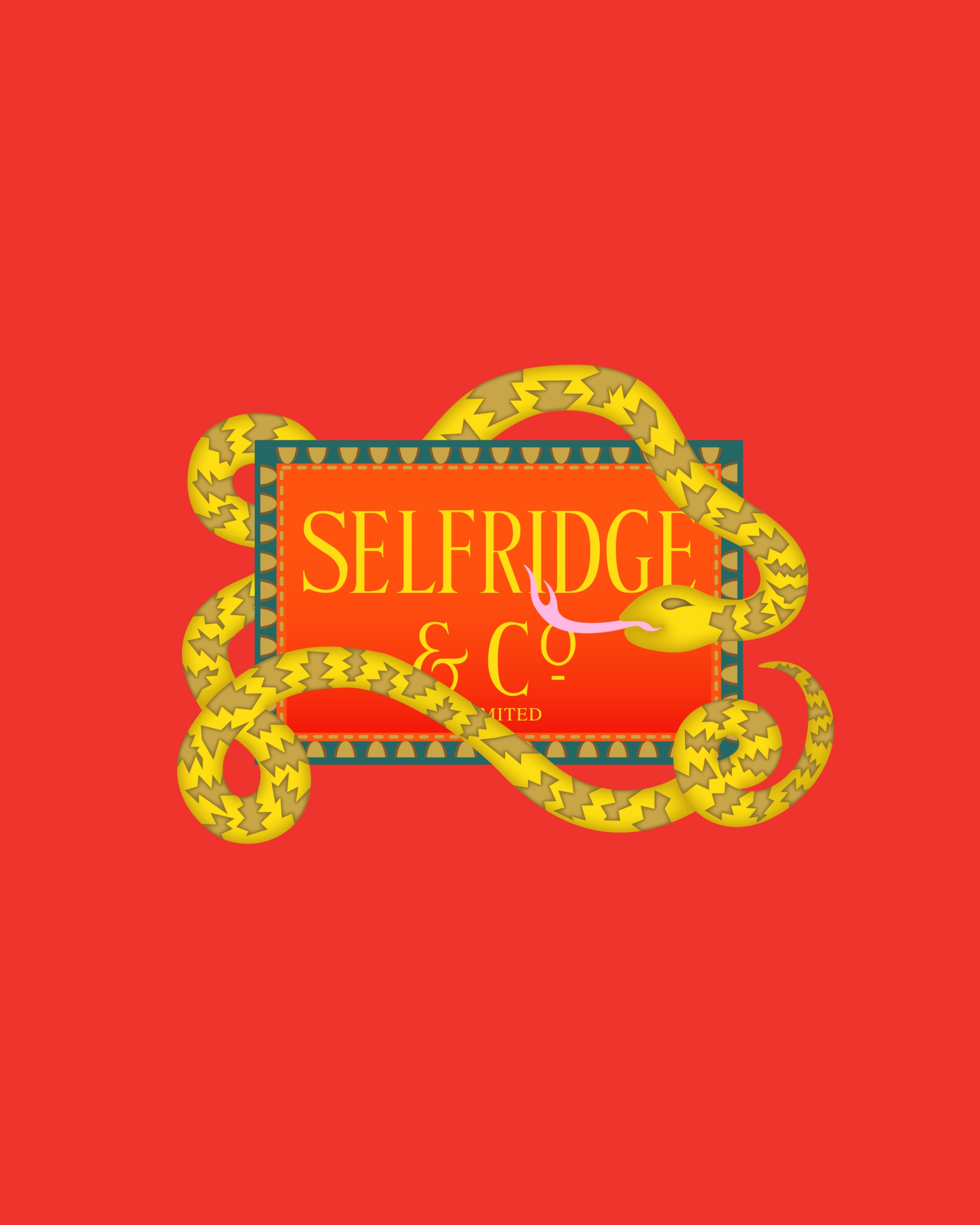
YEAR OF THE SNAKE
[Creative Direction] [Illustration by Can Yang]


SELFRIDGES COFFEE
[Design Direction]


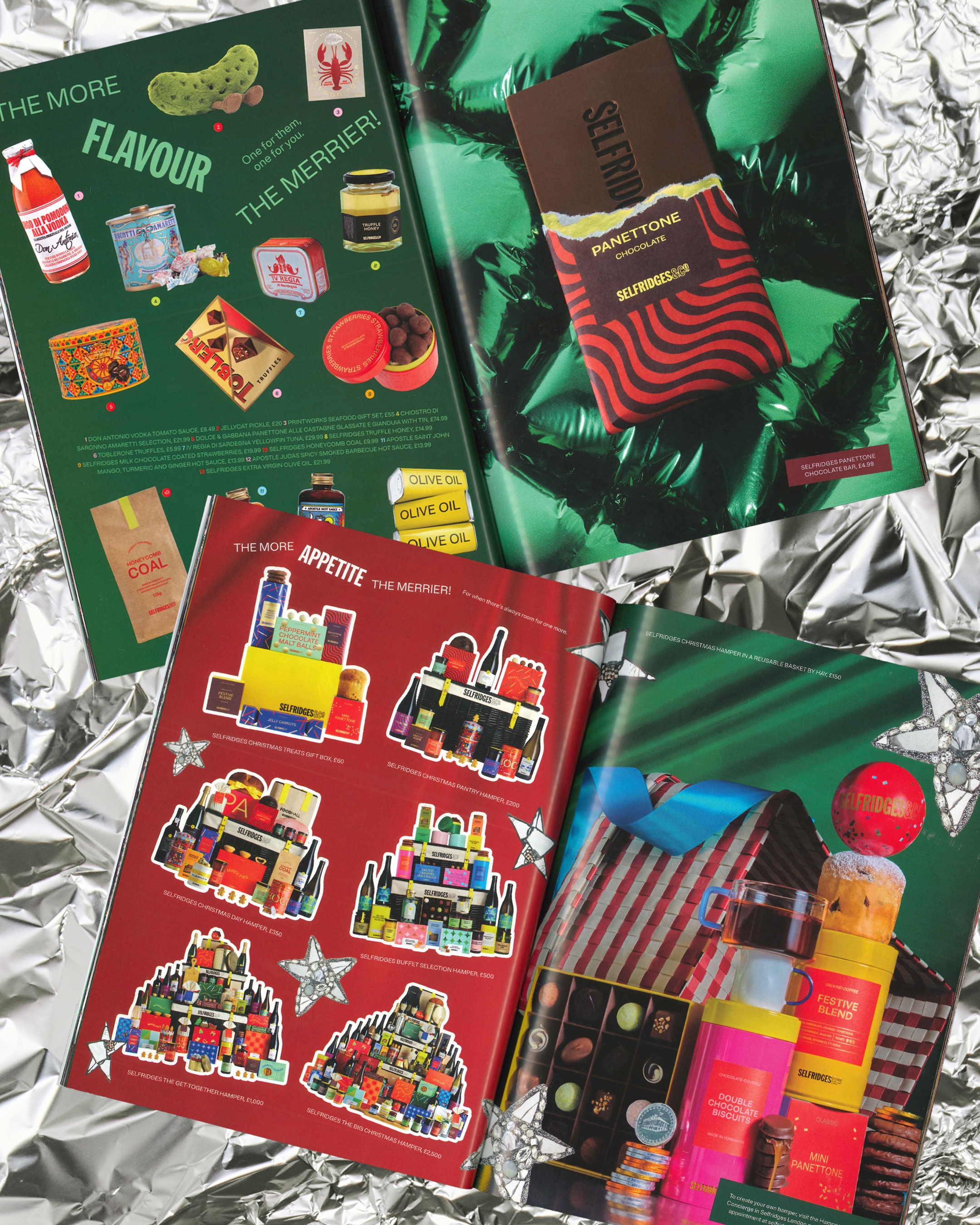


MORE THE MERRIER!
CHRISTMAS AT SELFRIDGES (2024)
All the fun. All at once. All together. Can’t overdo the decorations. Gifts of all shapes and sizes. Go on: pull up an extra chair, pull the crackers. Christmas pudding, panforte, pot lucks and borrowed traditions. Party tops and tracksuit bottoms. Prized leftovers. Anything goes. Ready for the countdown? Everyone’s made up and all the way dressed up. Brighter. Bolder. Glitter. It’s Christmas at Selfridges: More the Merrier!The design language centres on a handwritten “More the Merrier” logo, paired with a changing lock-up system ‘the more...the merrier!’ to reflect the diversity and abundance of a Selfridges Christmas. The Gift Guide embraces festive maximalism through bold colour, rich texture, and layered compositions, capturing the joyful chaos of the season. Playful, expressive, and vibrant, it celebrates the spontaneous spirit of the holidays, where more truly is merrier.
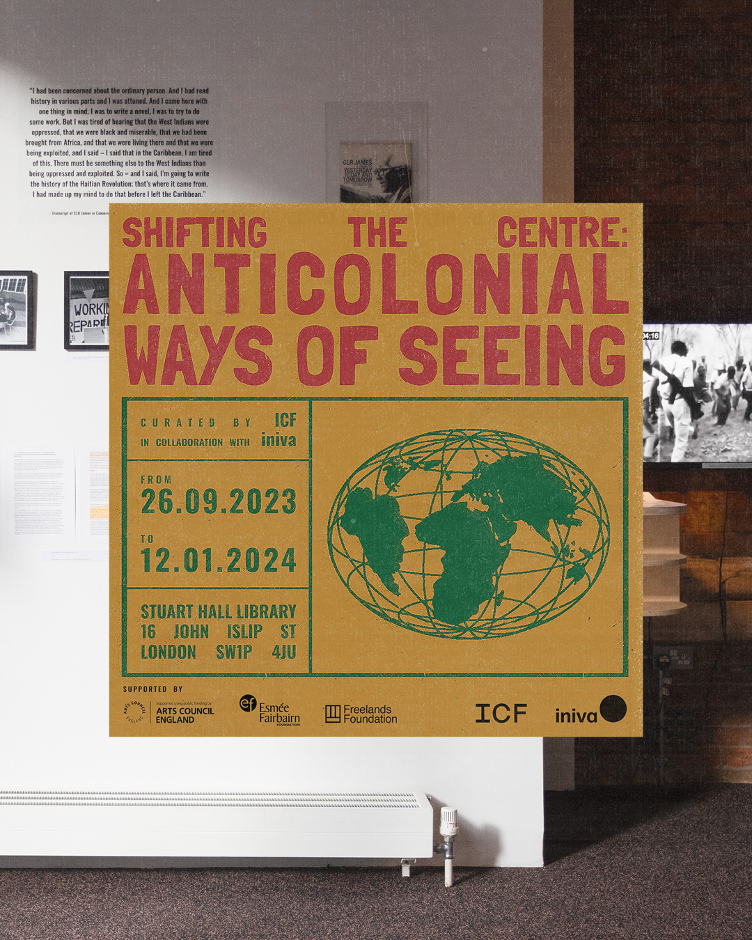
SHIFTING THE CENTRE: ANTICOLONIAL WAYS OF SEEING
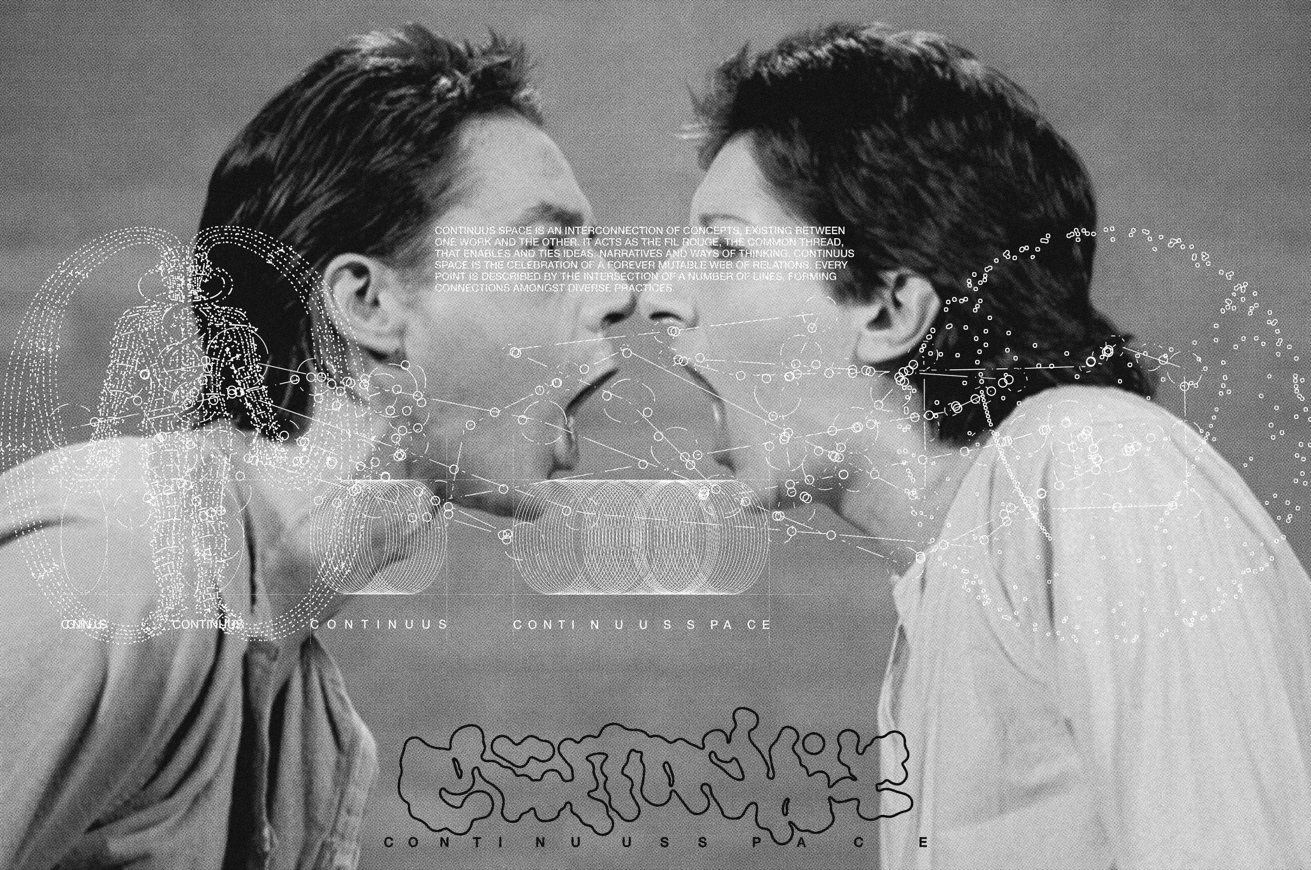
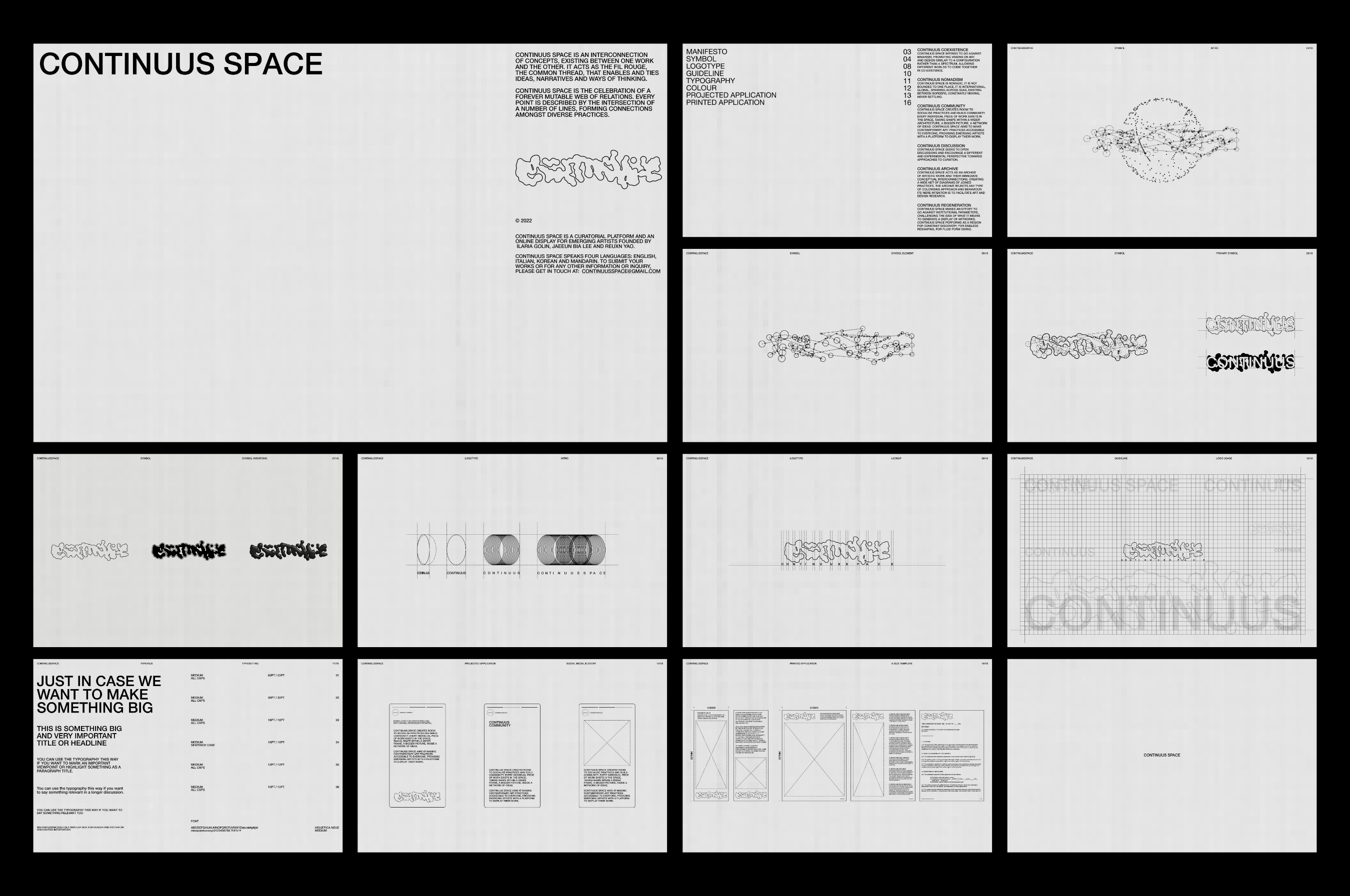
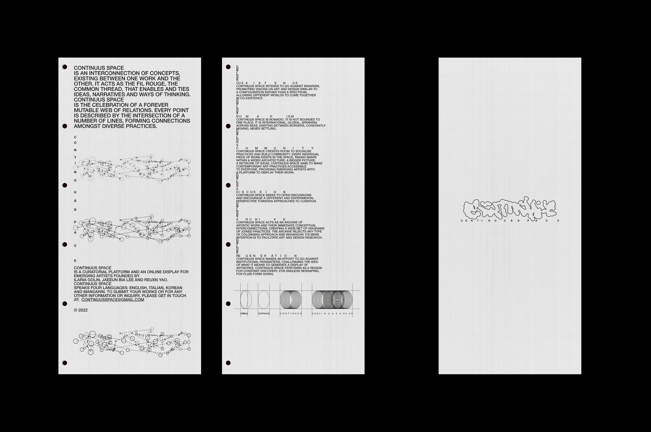
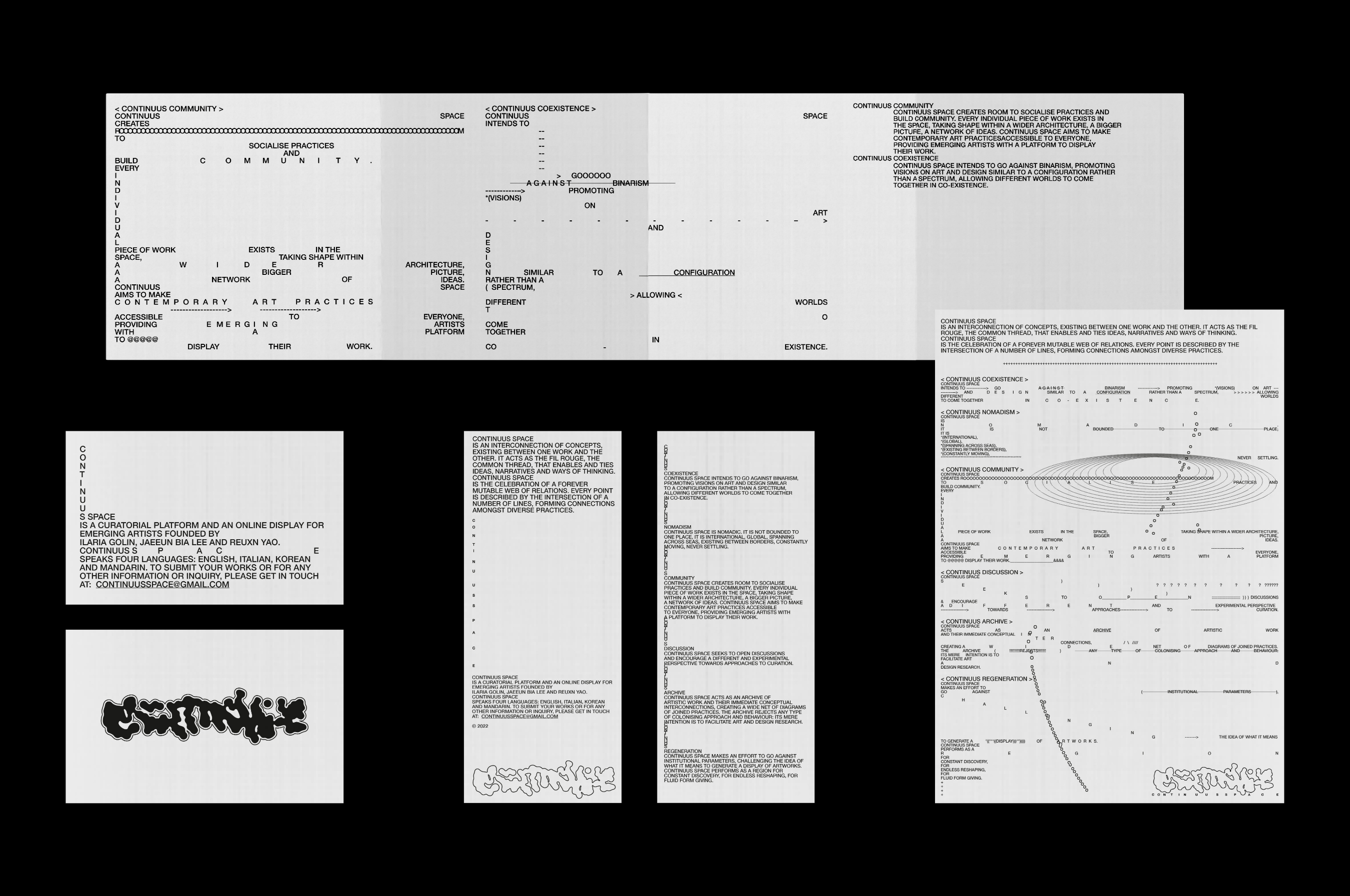
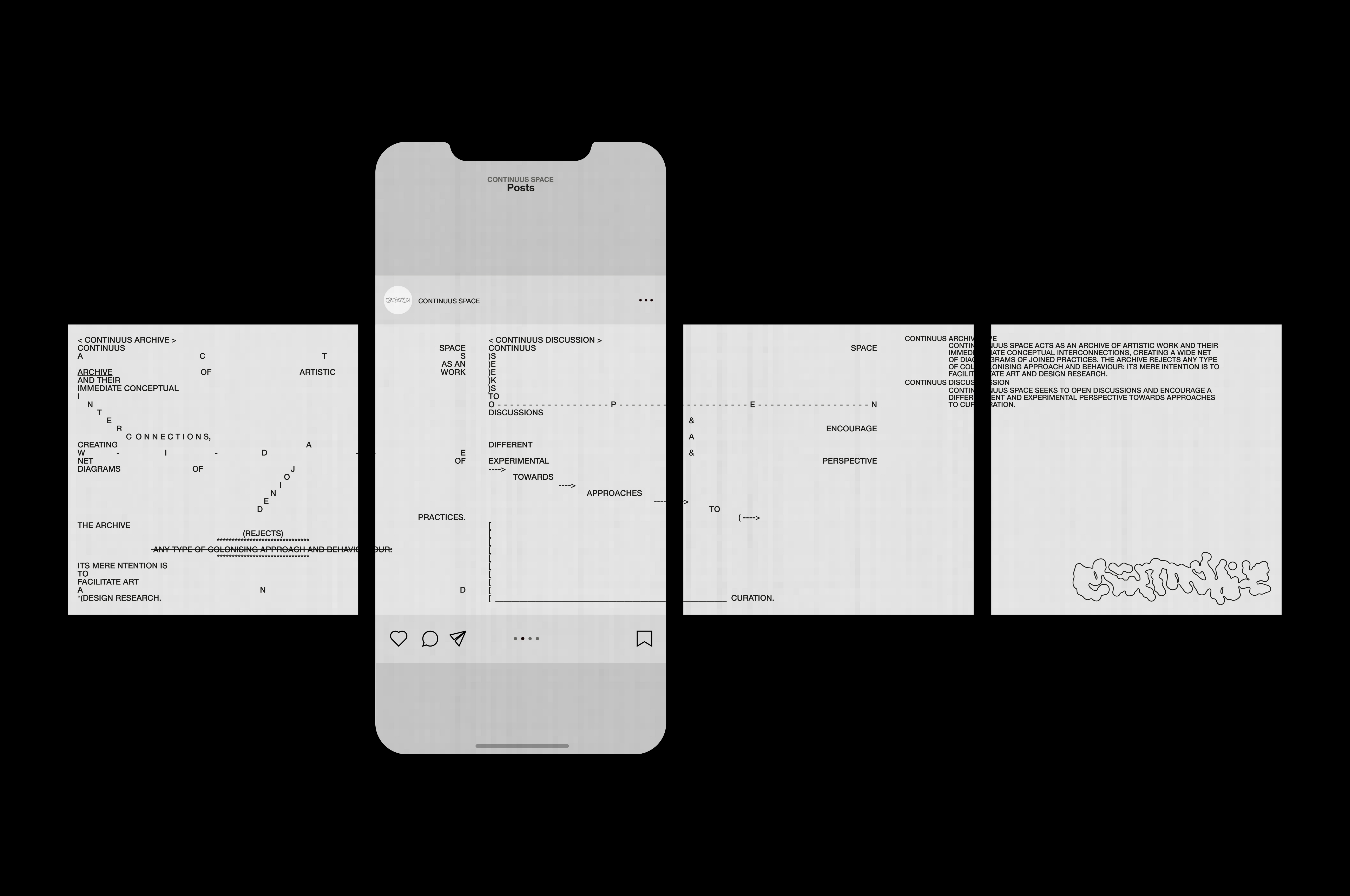

CONTINUUS SPACE
Continuus Space is an interconnection of concepts, existing between one work and another. It acts as the fil rouge, the common thread, that enables and ties ideas, narratives and ways of thinking. Continuus Space is the celebration of a forever mutable web of relations. Every point is described by the intersection of a number of lines, forming connections amongst diverse practices.Continuus Space’s main intention is to bring together diverse practices and ideas, to create space for discourse, while offering an online display for emerging artists.
IMMUNE SYSTEM [Rebrand]


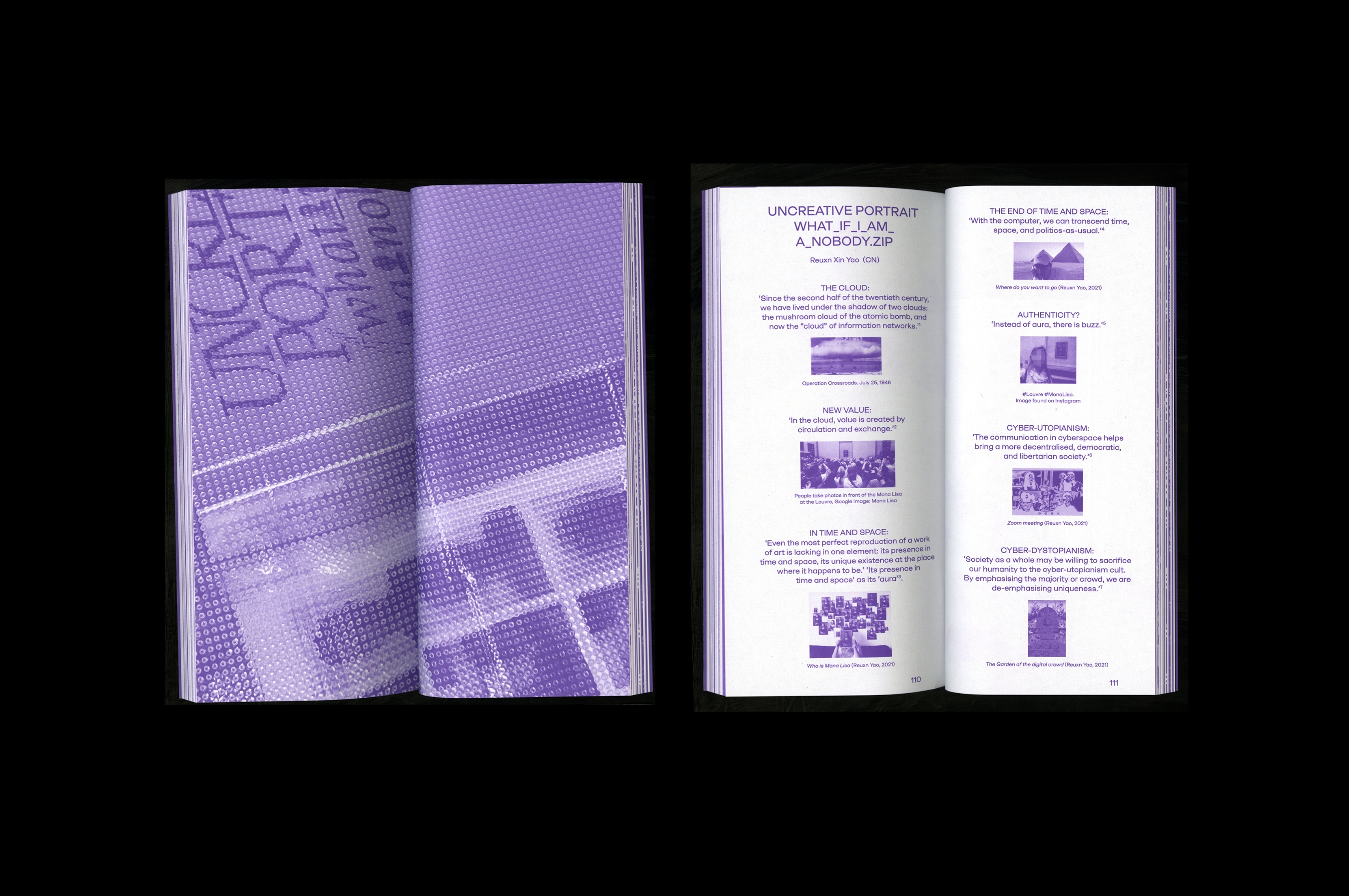
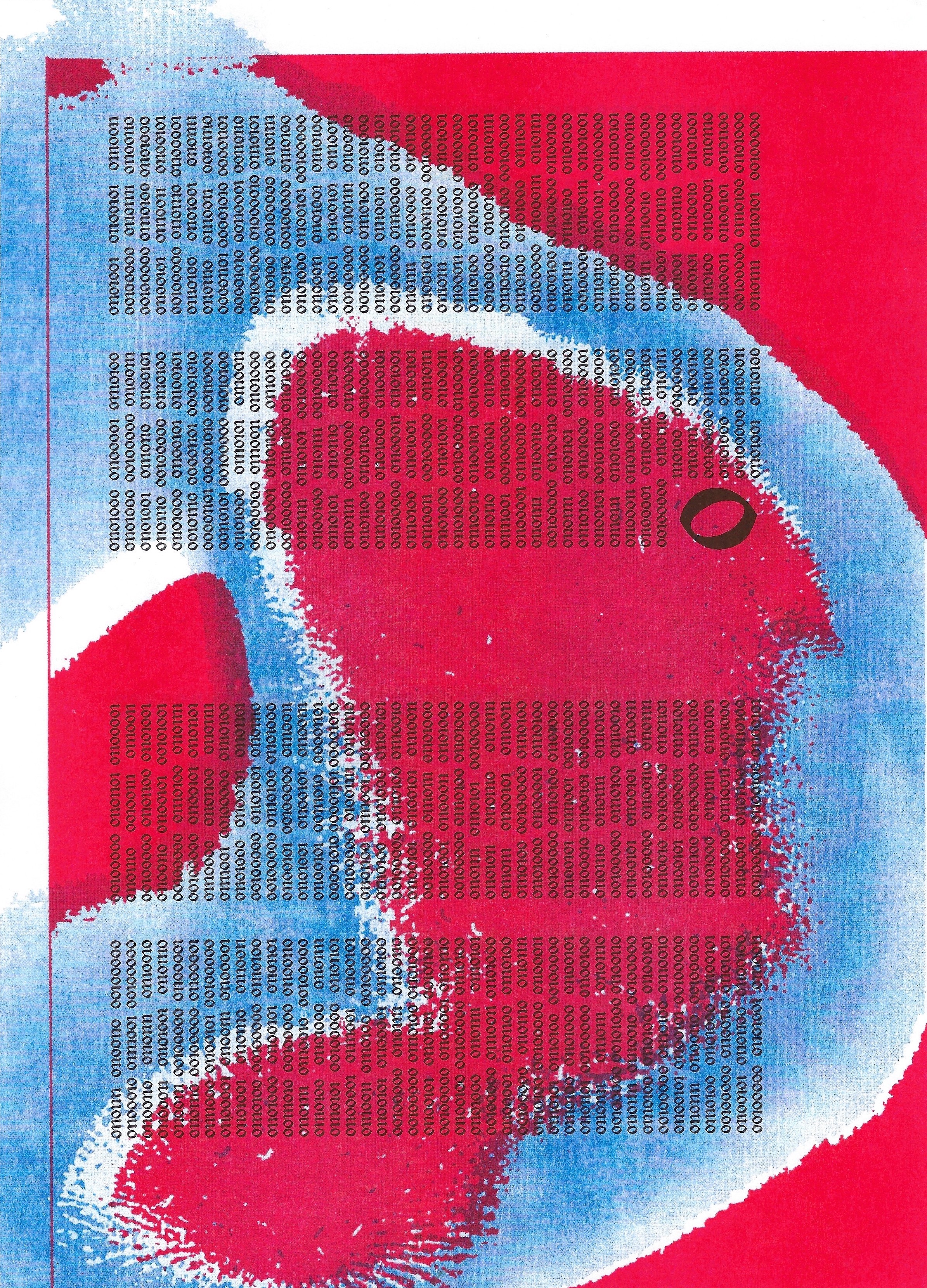
UNCREATIVE PORTRAIT_WHAT_IF_I_AM_A_NOBODY.ZIP
‘Uncreative portrait’ is an accumulation that documents the designer’s single portrait in multiple visual languages produced by the impact of computers and cyberspace.By examining the digital sublime as an alternative visual representation, it establishes a discourse around the aura of self-identity in the age of digital reproduction. These images continuously explore our digital selves’ shifting authenticity and identity in the contemporary digital era. Is there a line between the self and its data shadow? Where is our physical memory going in this endless re-identification process?
The ‘pdf’ includes 300 interpretations of the designer’s own portrait, calling into question the ever-changing process of individuation as well as the ongoing process of redefinition in the context of the contemporary sublime.
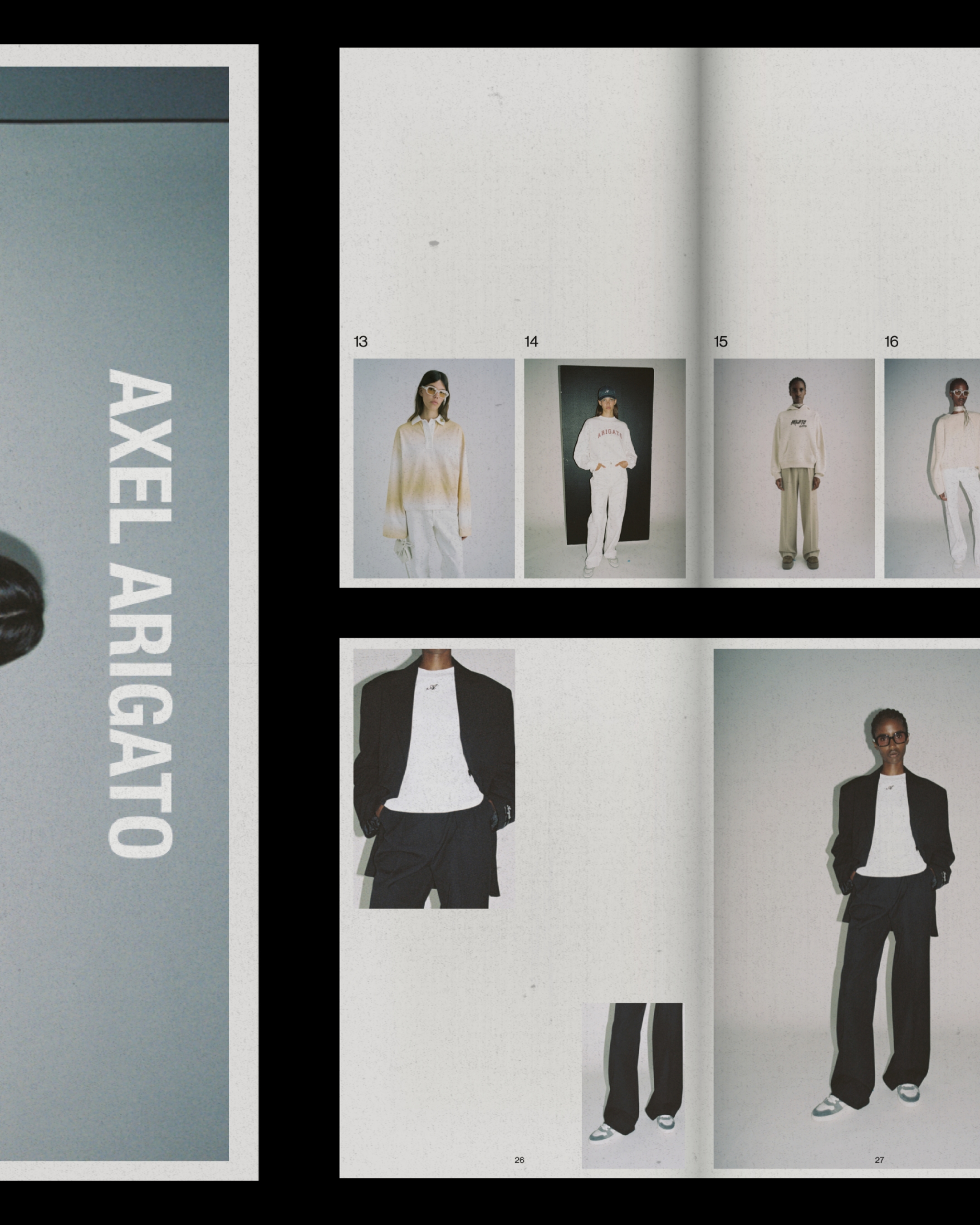
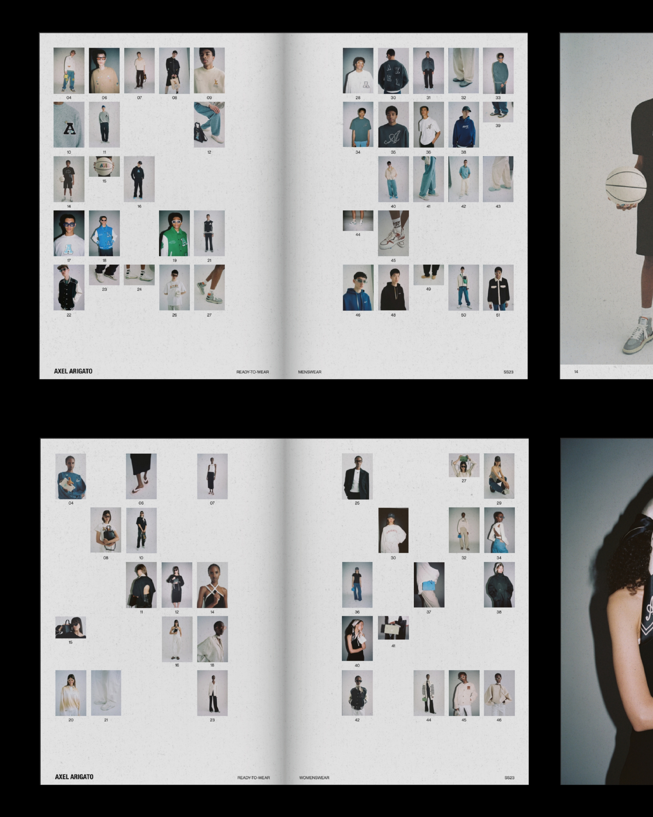

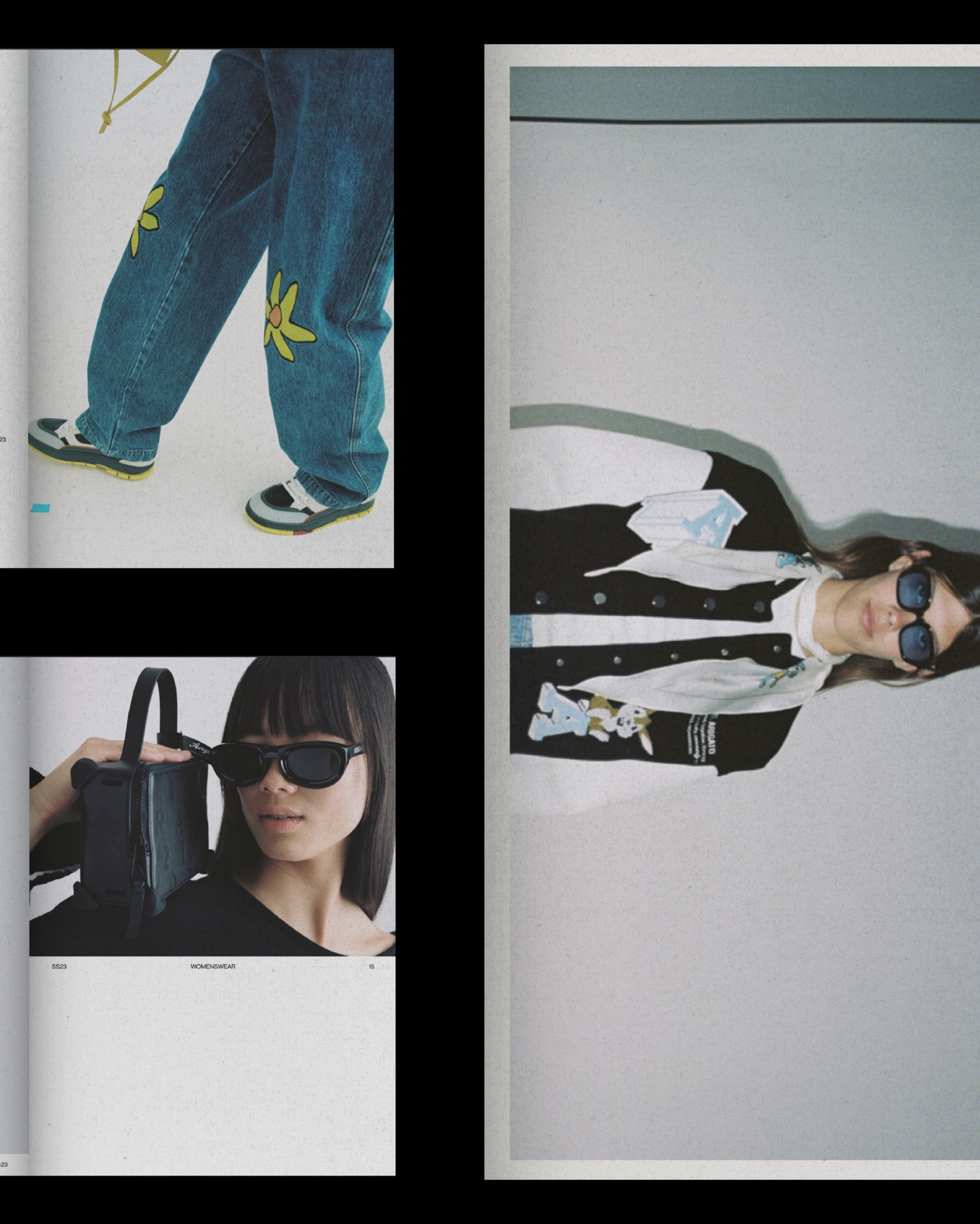
AXEL ARIGATO SS23 LOOKBOOK
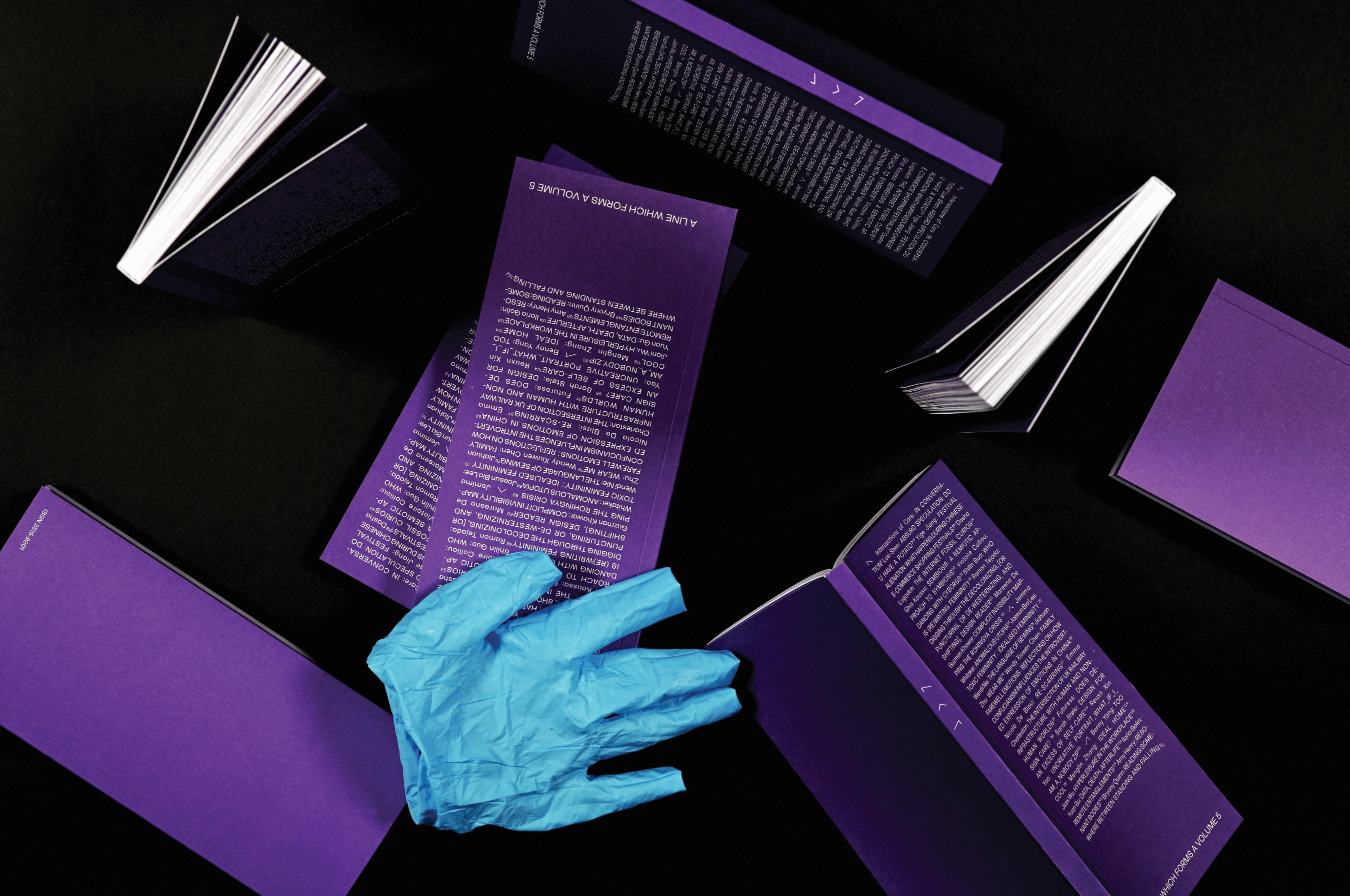
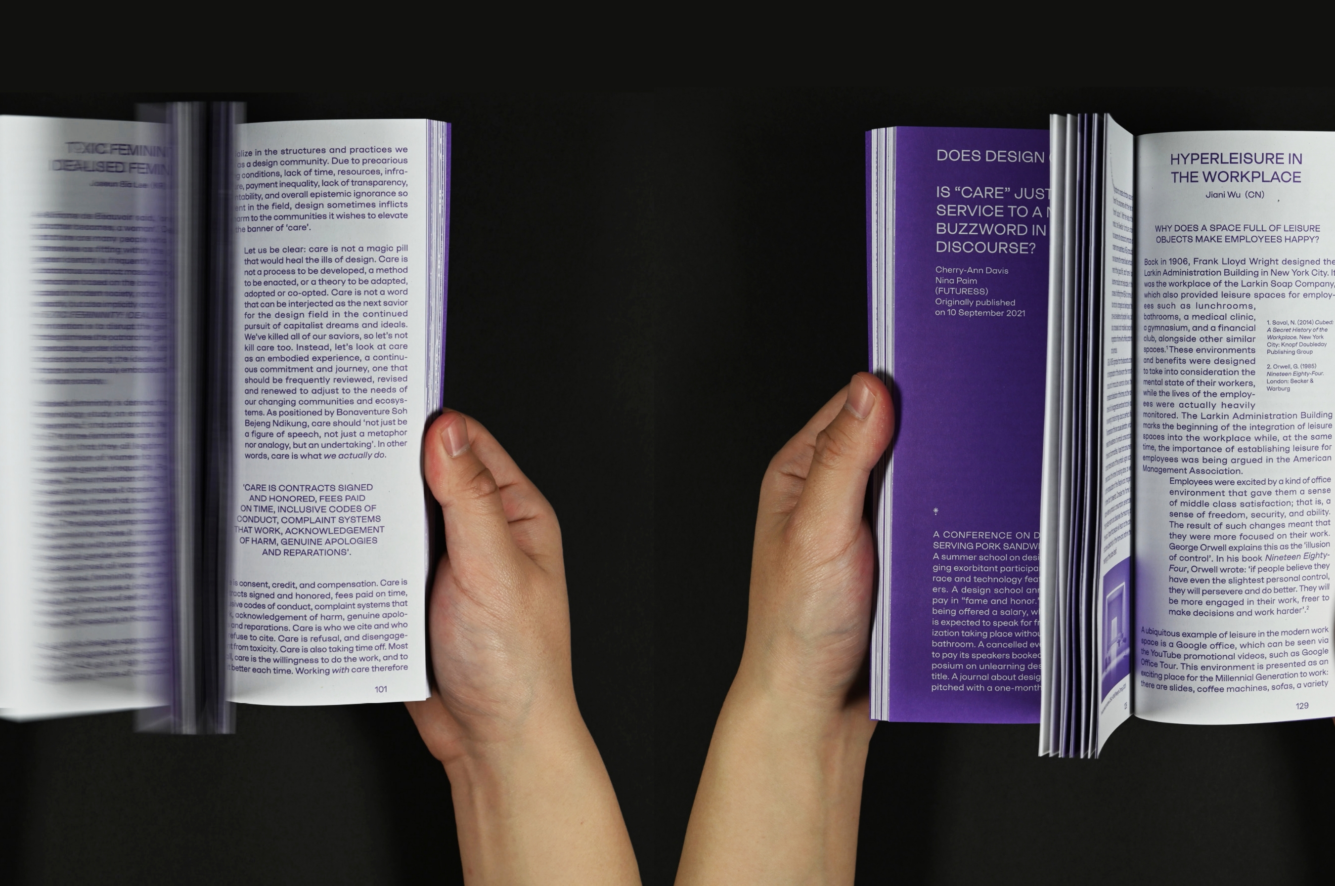

A LINE WHICH FORMS A VOLUME 5
A Line Which Forms a Volume 5 is a critical reader and symposium of graphic design-led research, which is written, edited, designed, and published by participants of the MA Graphic Design course at London College of Communication. The fifth issue explores acts of leaning and how they interconnect with concepts of care and transparency in the process of making design research public.We see leaning as the result of diverging forces seeking shared stability and collaboration. When leaning, we defy structural integrity, and we let vulnerability arise. As our practice leans on, through, into and towards a subject (and vice versa), we show and exercise care for the complexities of contemporary society.
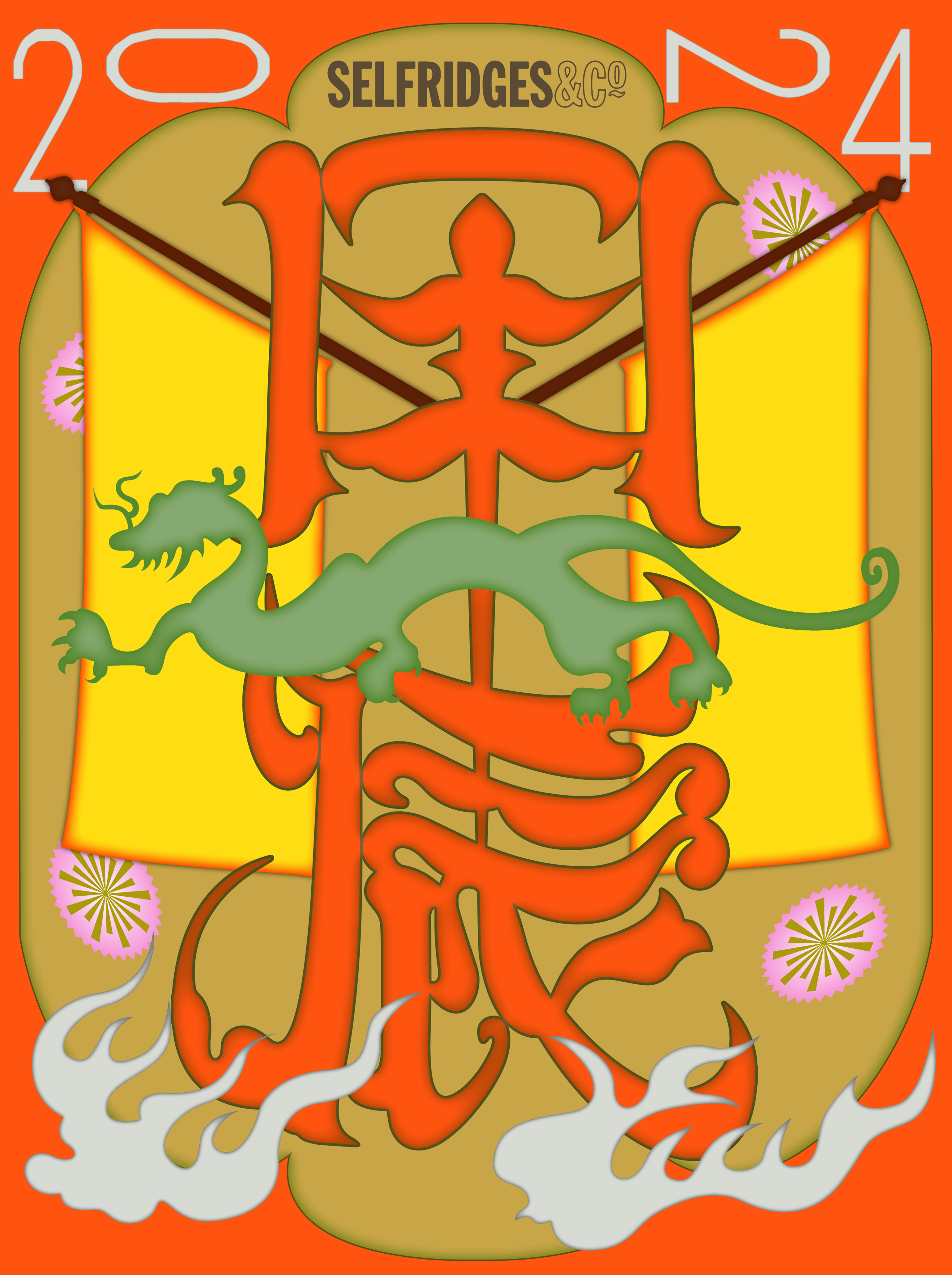
YEAR OF THE DRAGON
[Creative Direction] [Illustration by Can Yang]
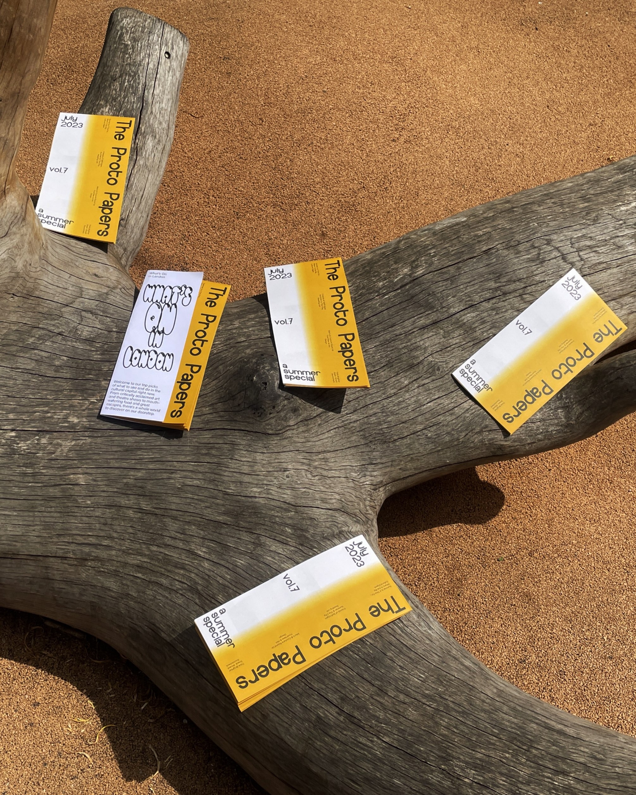


PROTOPAPERS - A SUMMER SPECIAL
![]()

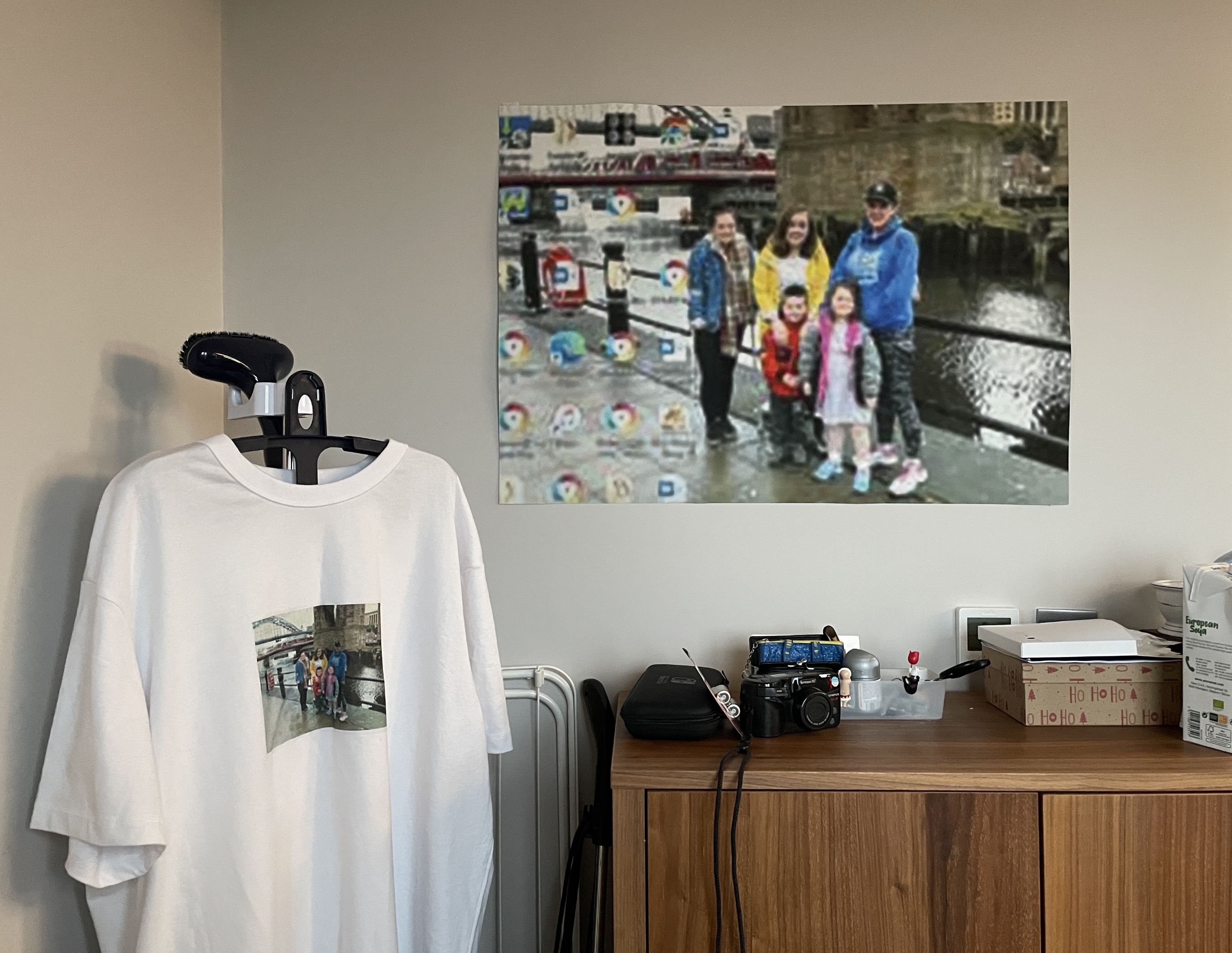
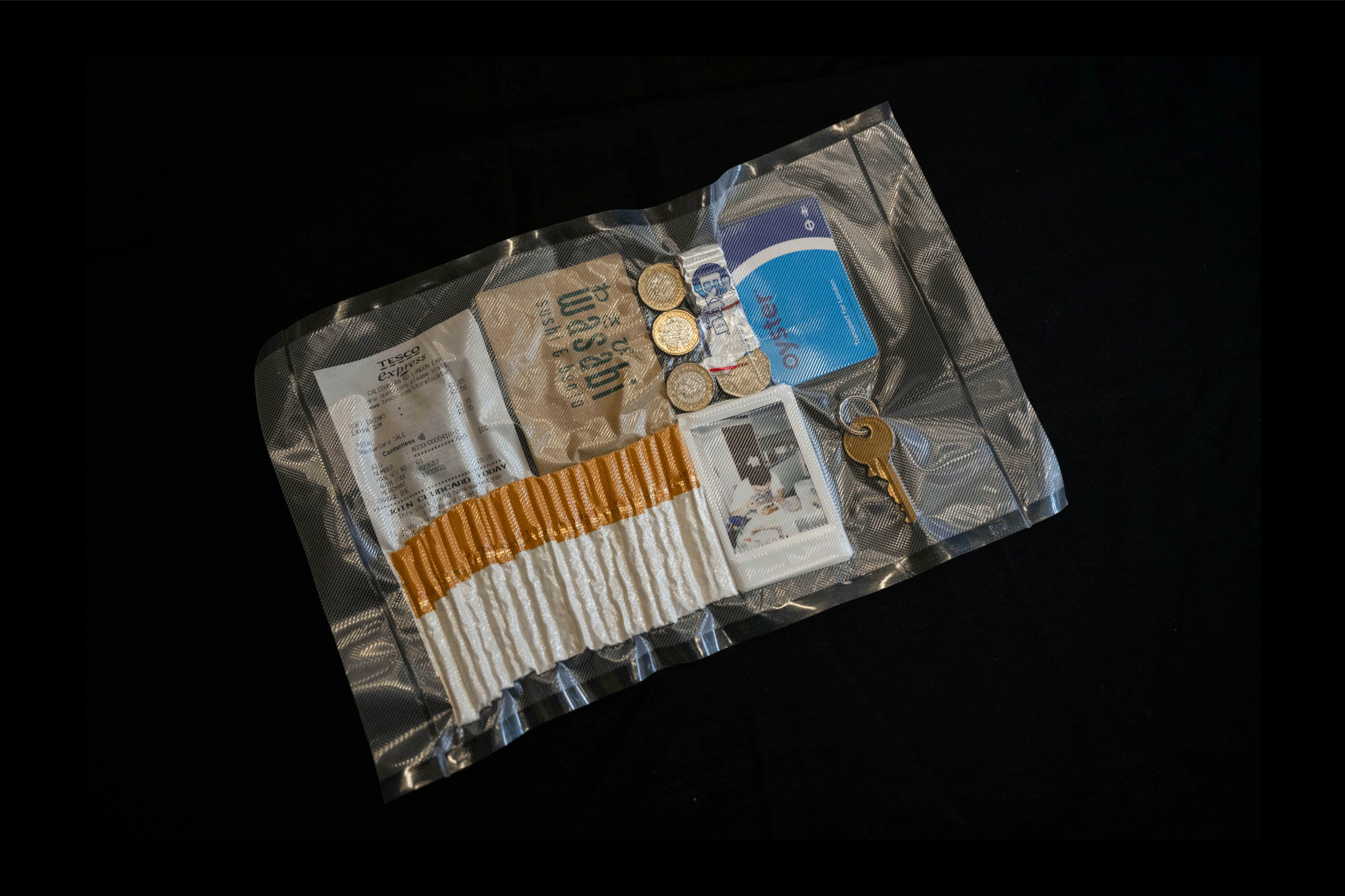
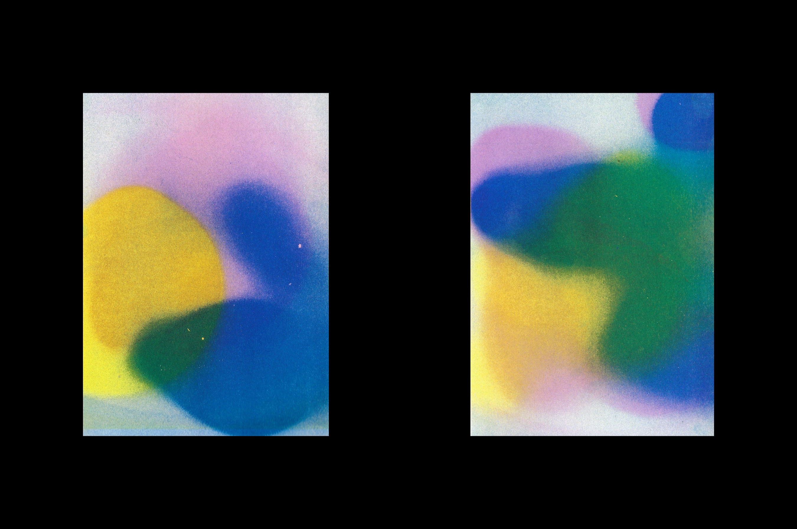
DIGITAL MEMORY
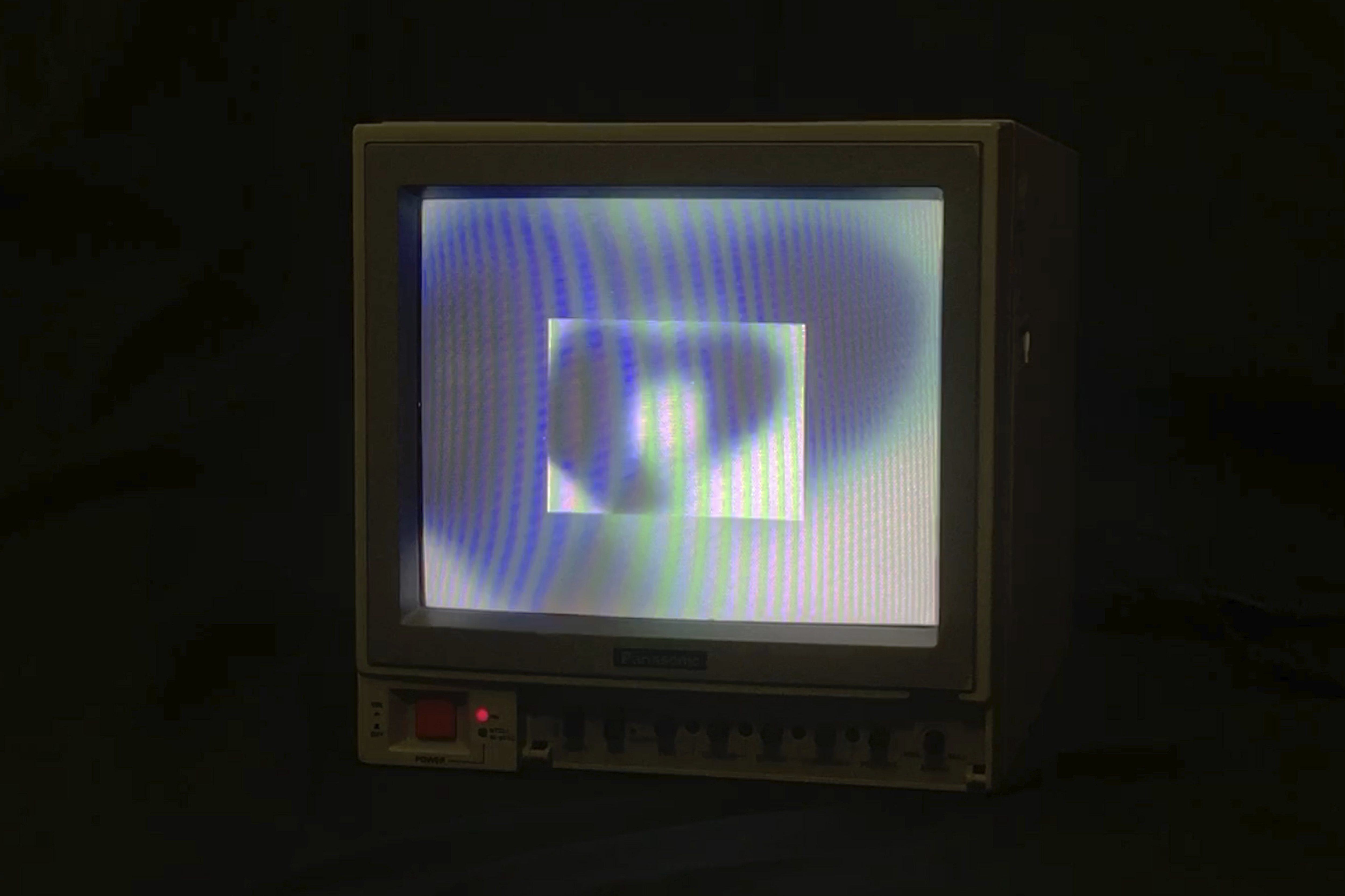
![]() MATERIALISED CYBERSPACE
MATERIALISED CYBERSPACE
![]()
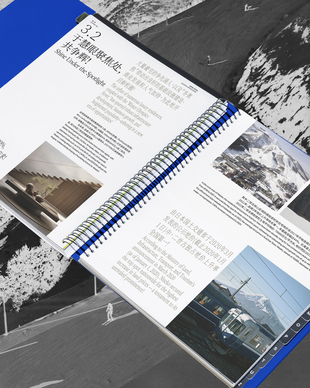
![]() NISEKO RESORT CATALOGUE DESIGN
NISEKO RESORT CATALOGUE DESIGN


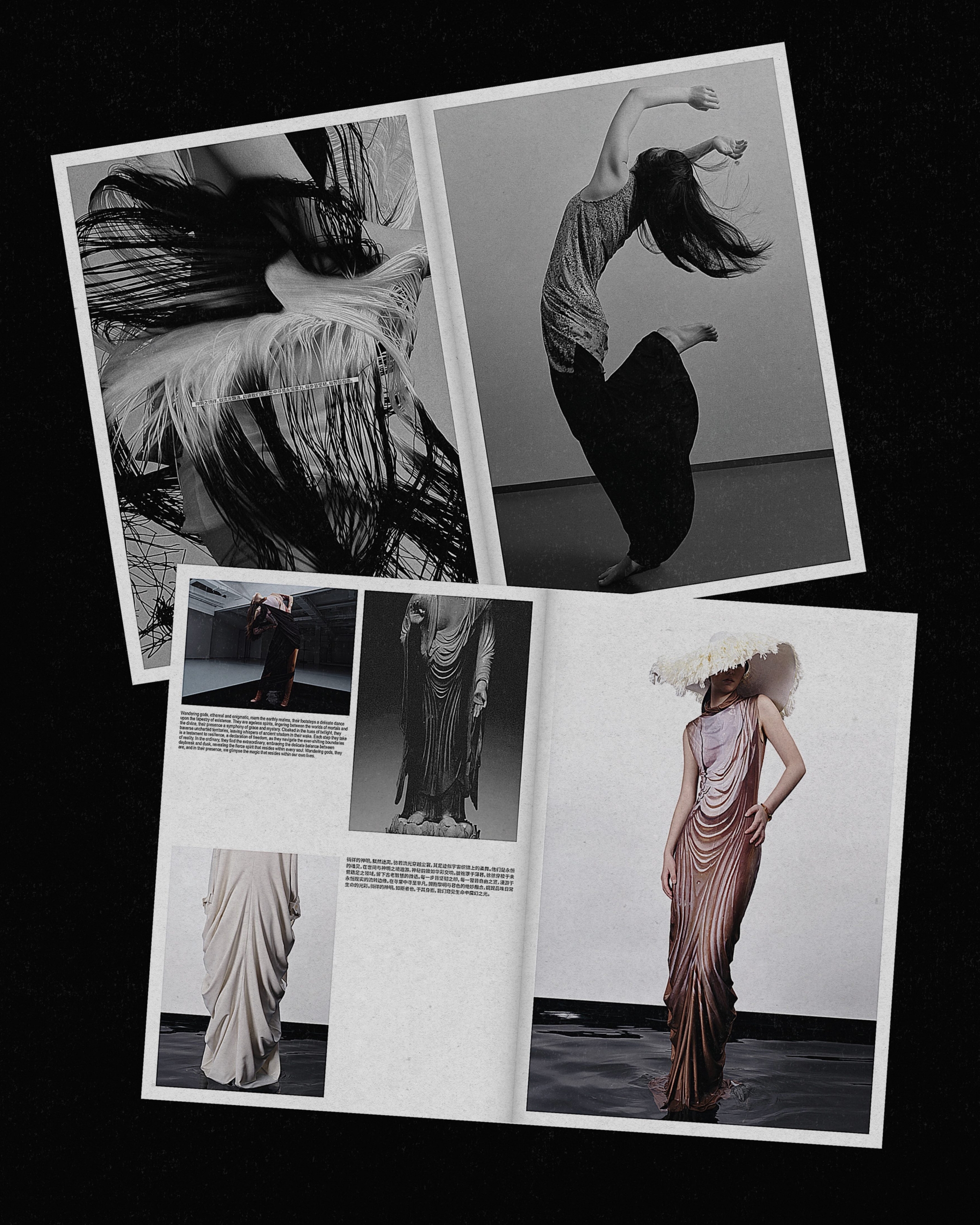
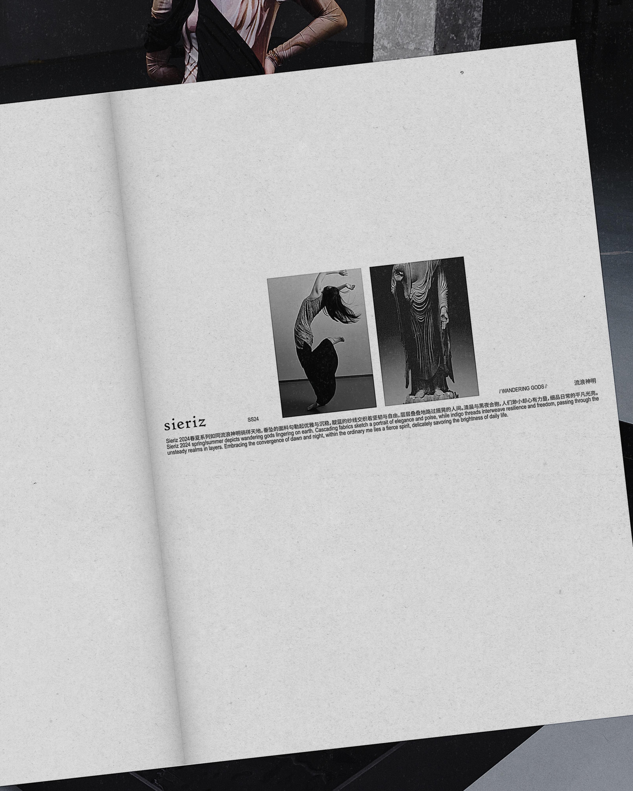

SIERIZ SS24 LOOKBOOK
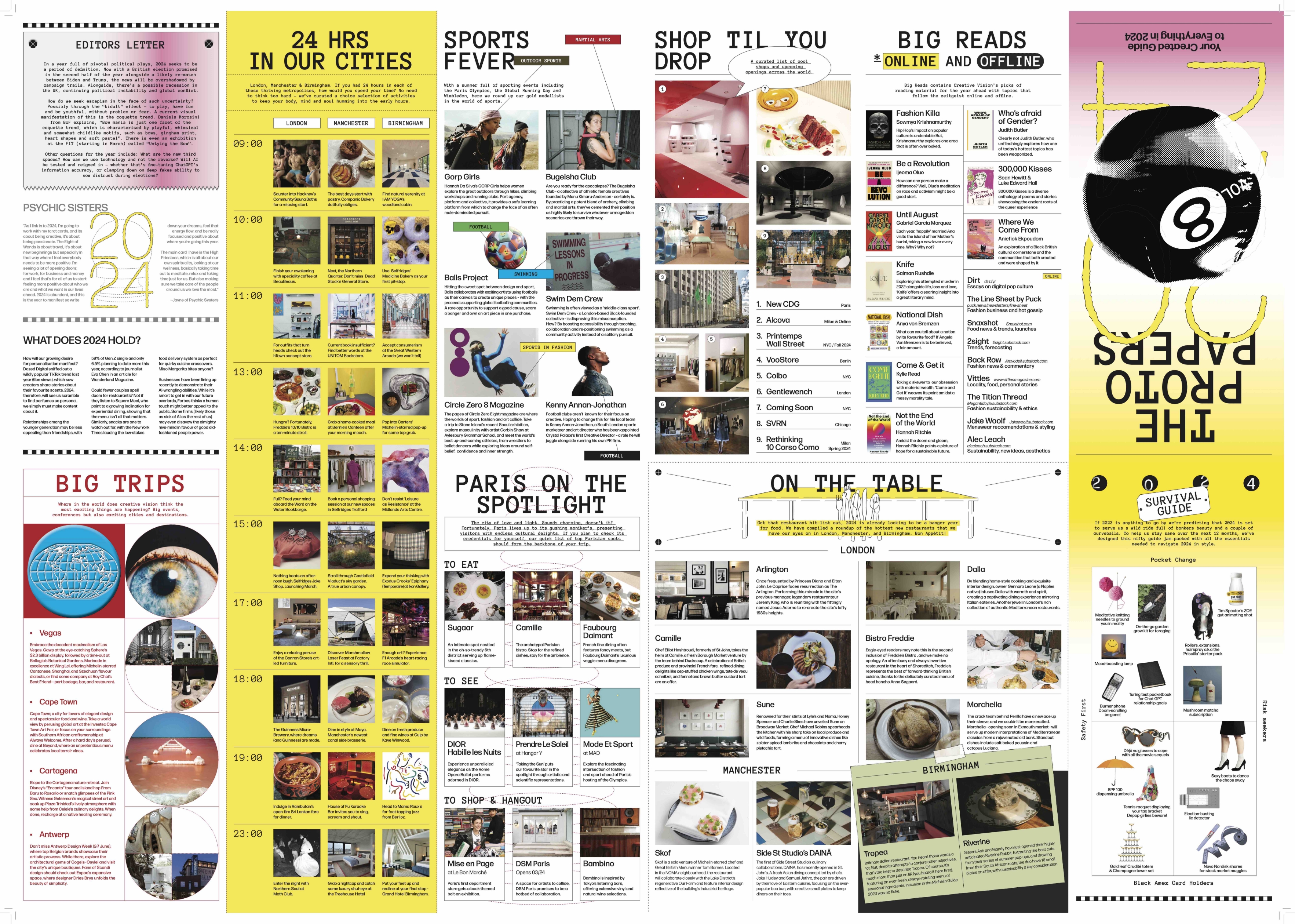

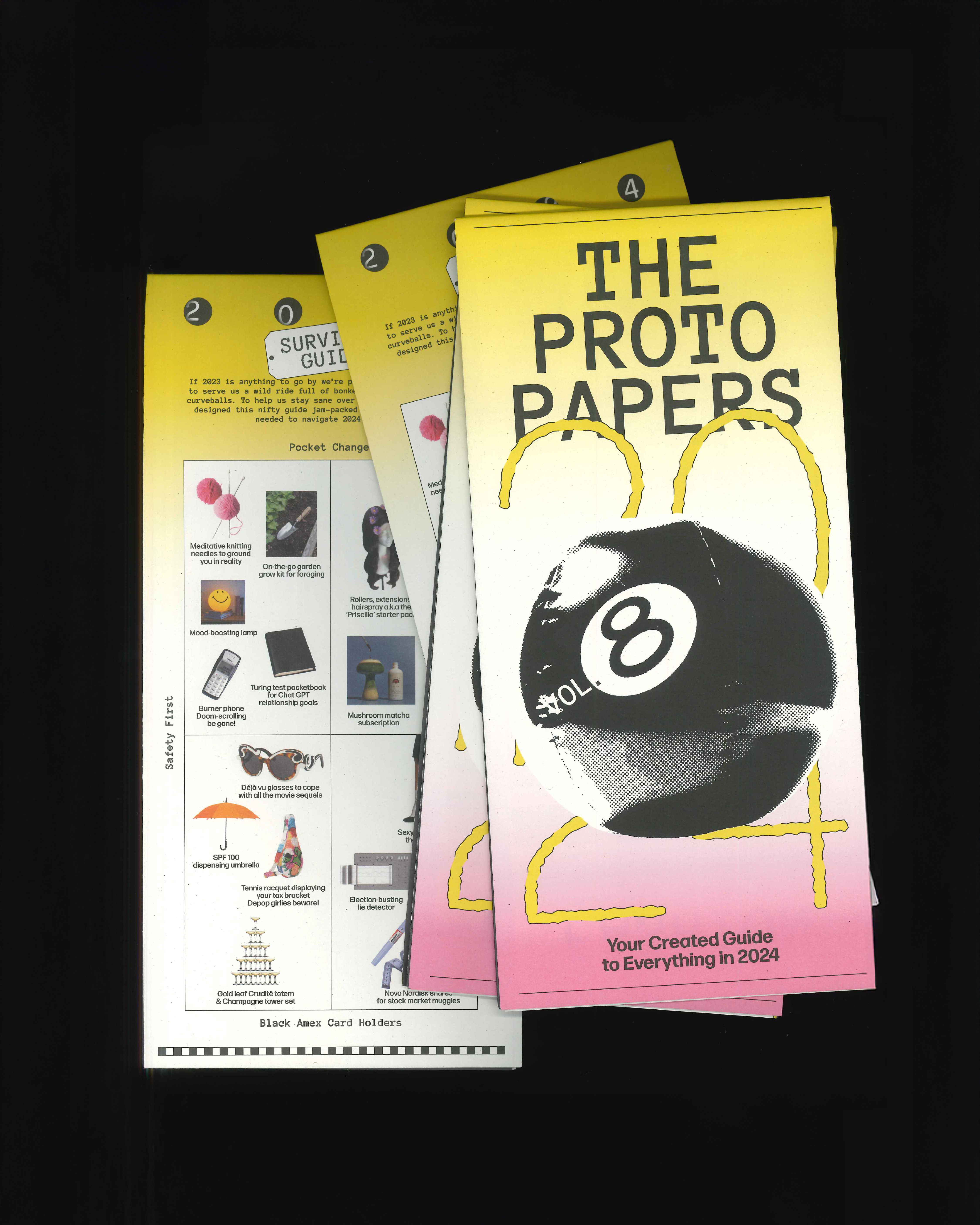
PROTOPAPERS VOL_8
(A1 flat size fold to 297x210m)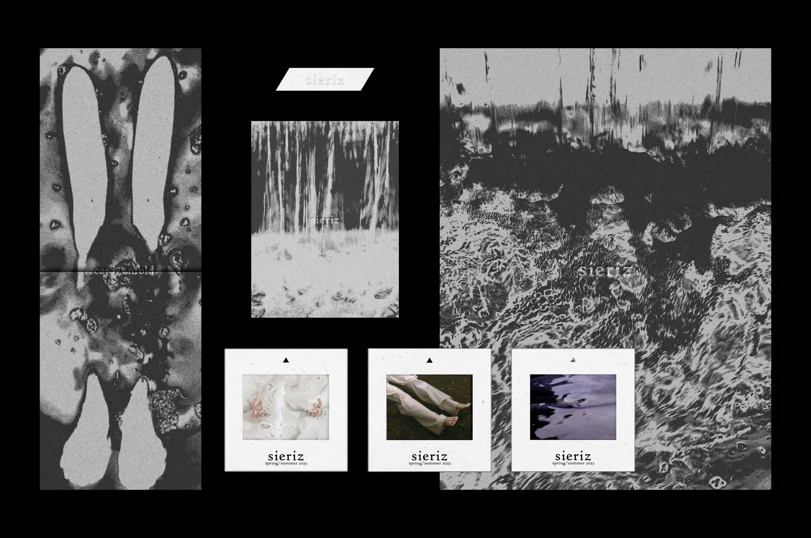
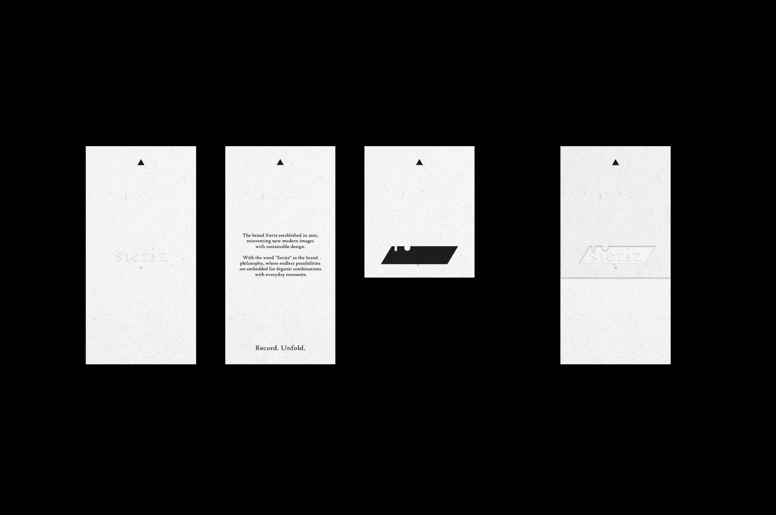
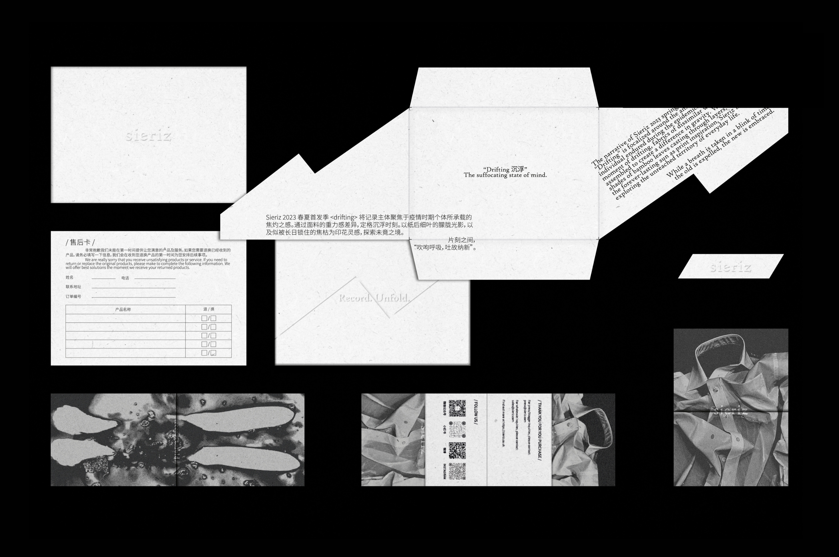

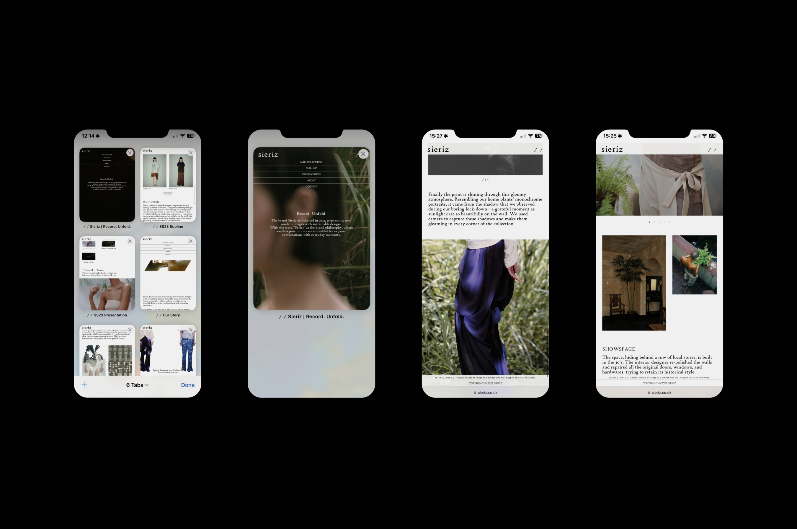
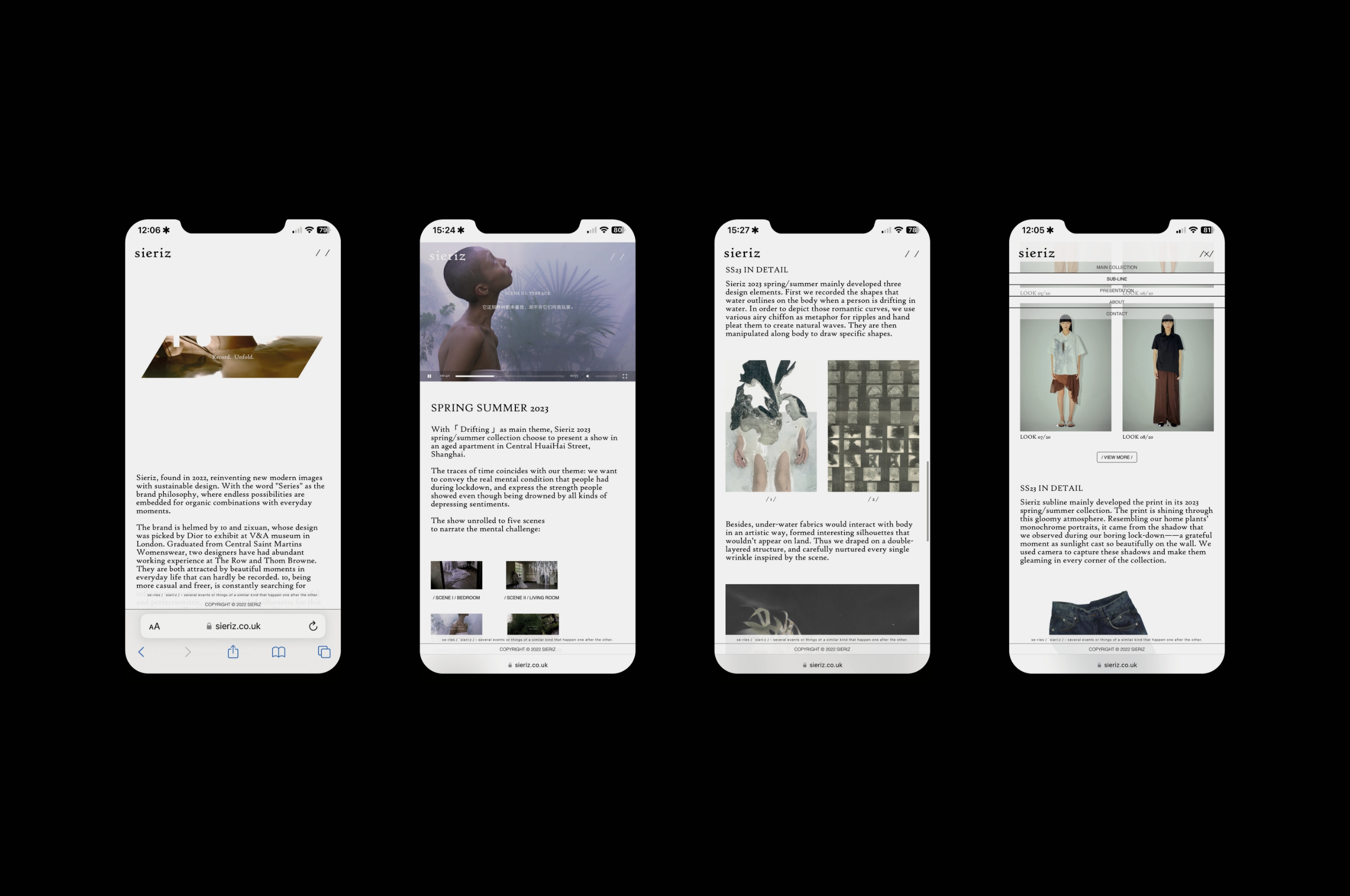
RECORD. UNFOLD.
A collection of print and digital resources created for the emerging womenswear fashion label Sieriz. The brand's slogan, "Record. Unfold," served as inspiration for the visual language, which aims to emphasise the movement of being captured by the body and unfolded by the body. The material is "recorded" and "hidden" by the form itself, but it is discovered throughout the unfolding process. With the word "Series" as the brand philosophy, where endless possibilities are embedded for organic combinations with everyday moments. Through the transformation of the phonetic alphabet to demonstrate the interpretation of the brand to give multiple senses, both visual and audible, the design components aim to visualise the pronunciation of "series" through its own manifestation. →website

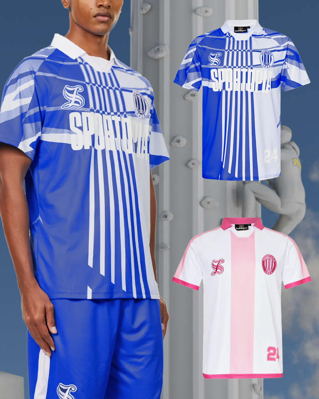
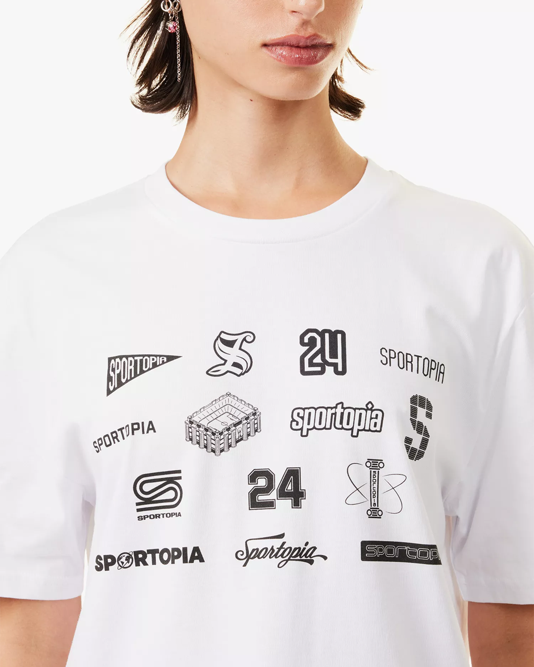
SPORTOPIA MERCH DESIGN
![]() POETIC RESEARCH [VISUAL ESSAY]
POETIC RESEARCH [VISUAL ESSAY]


20170510


SIERIZ AW23 LOOKBOOK
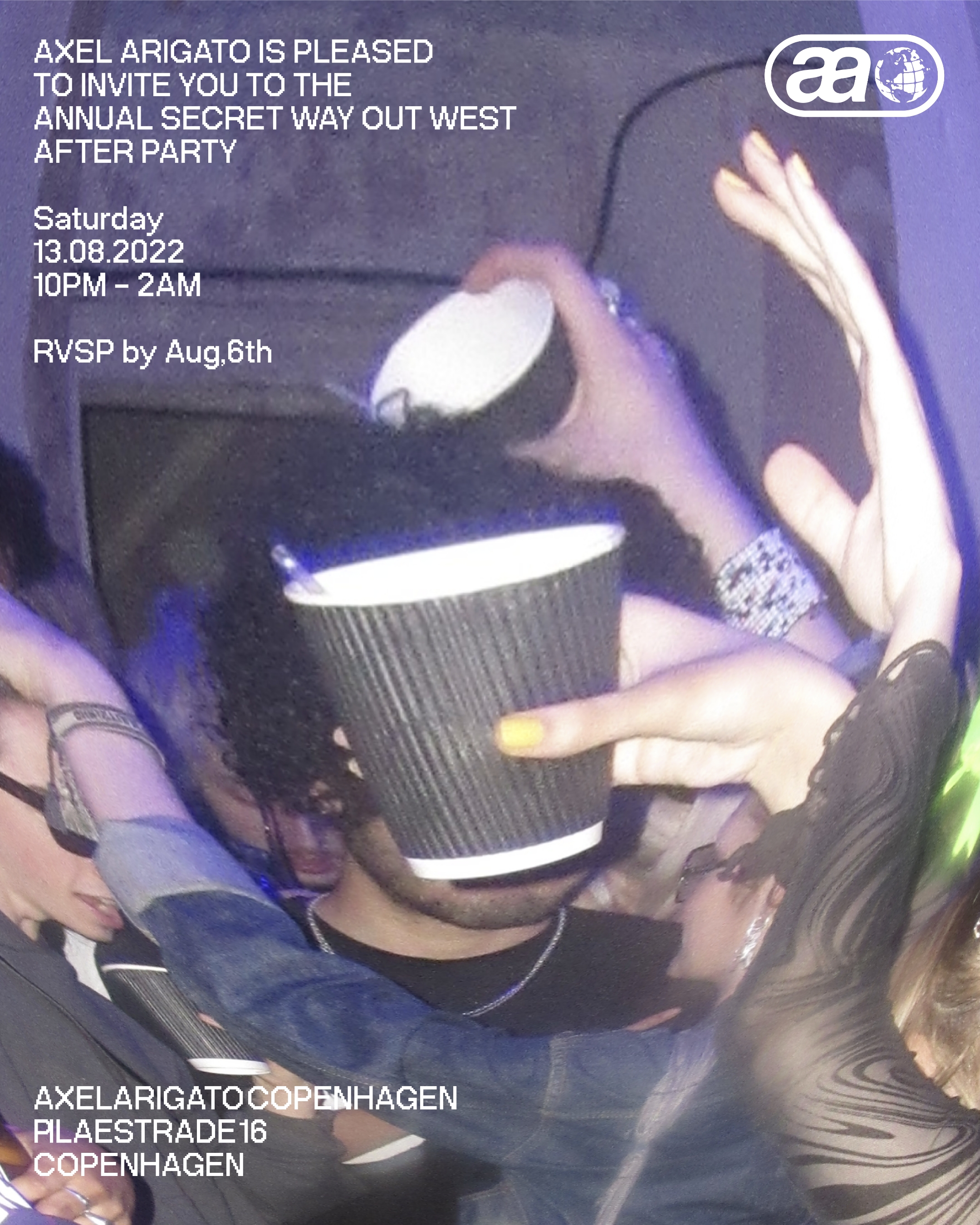
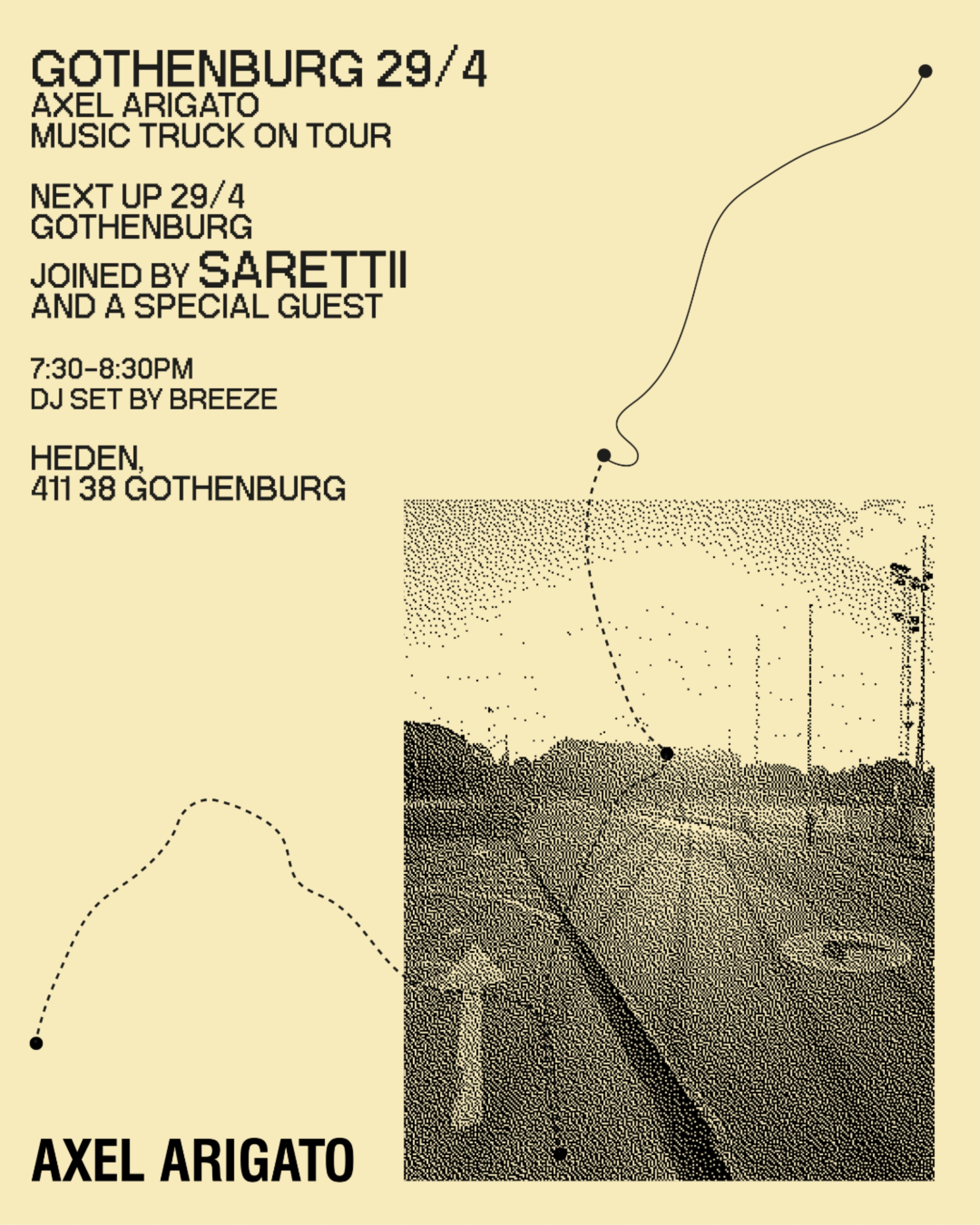

EVENT POSTERS FOR AXEL ARIGATO
THE (CHAIR)
This research-led practice aims to demonstrate the numerous comprehension perspectives through the interpretation and representation of the objects. To rethink our position in the relationship between the material world by exploring the deeper significance of our everyday objects. As a response to the human-centred perspective, I was trying to reverse the relationship of human and object, to look for the subjective object, to explore the narrative behind them, and the interpretation from the objects themselves.
THREE LANDSCAPE IMAGES

DIGITAL SUBLIME [Visual Essay]
![]() AXEL ARIGATO SOCIAL DESIGN
AXEL ARIGATO SOCIAL DESIGN
![]()


WHAT DOES DESIGN MEAN TO YOU?
“Something is only what it is in its relation to another, but by the negation of the negation this something incorporates the other into itself." -Hegel’s Dialectics, 19th CenturyThis project is based on the law of ‘the negation of the negation’ to rethink
and reflect the contemporary design in today’s consumerist society. The aim is to make a real difference in the design industry, not necessarily
through designing artefacts, but by challenging public perception and changing systems rather than merely boosting lifestyles. To engage a broad audience in a context that will challenge and provoke the public to rethink the role of design in contemporary culture.
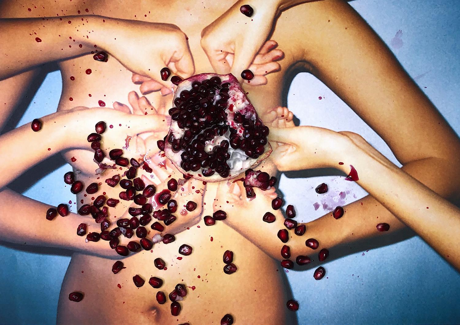
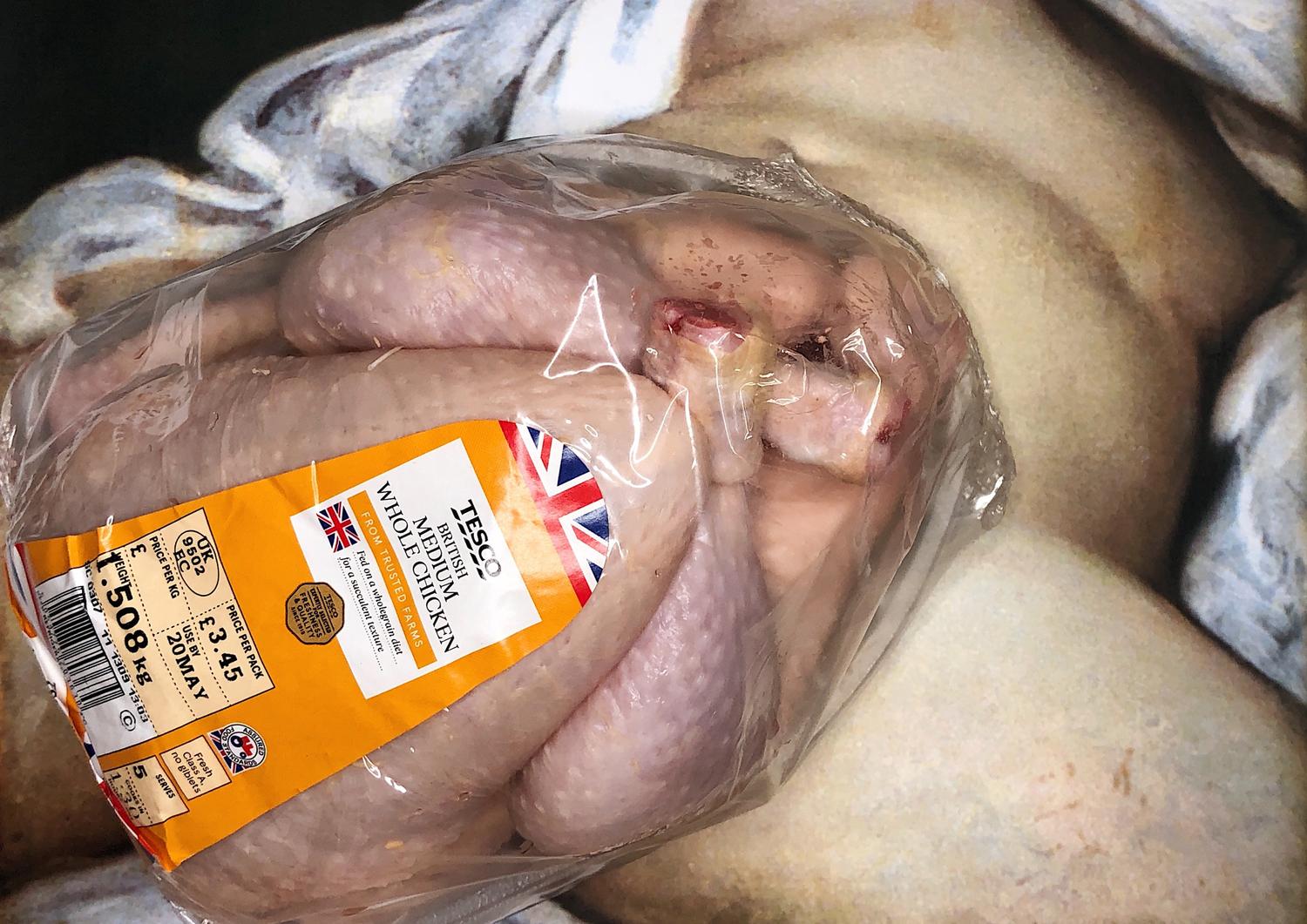
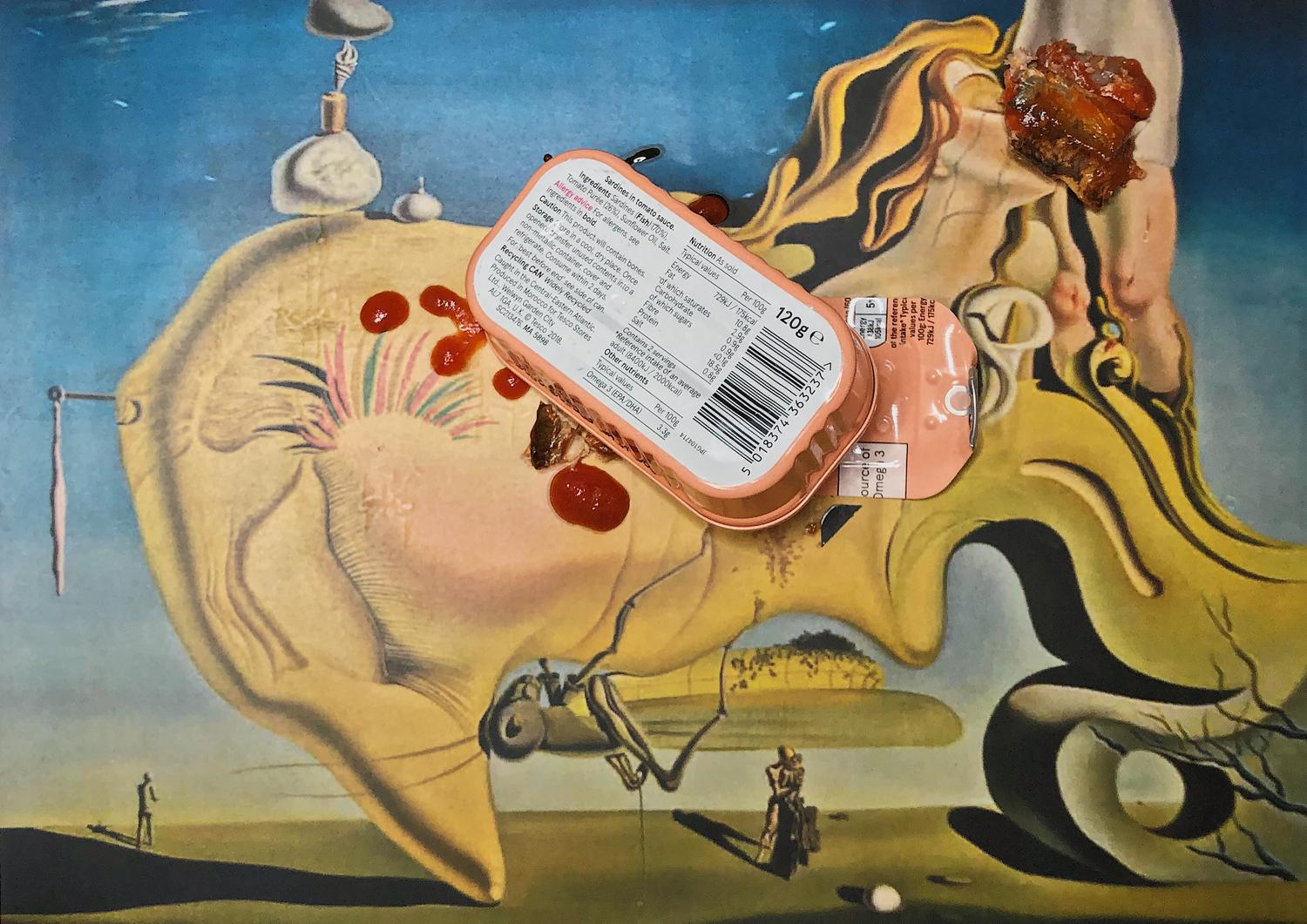
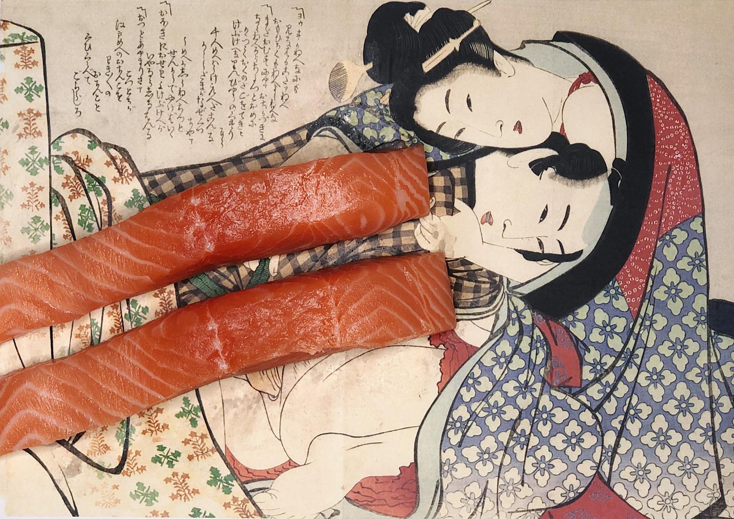
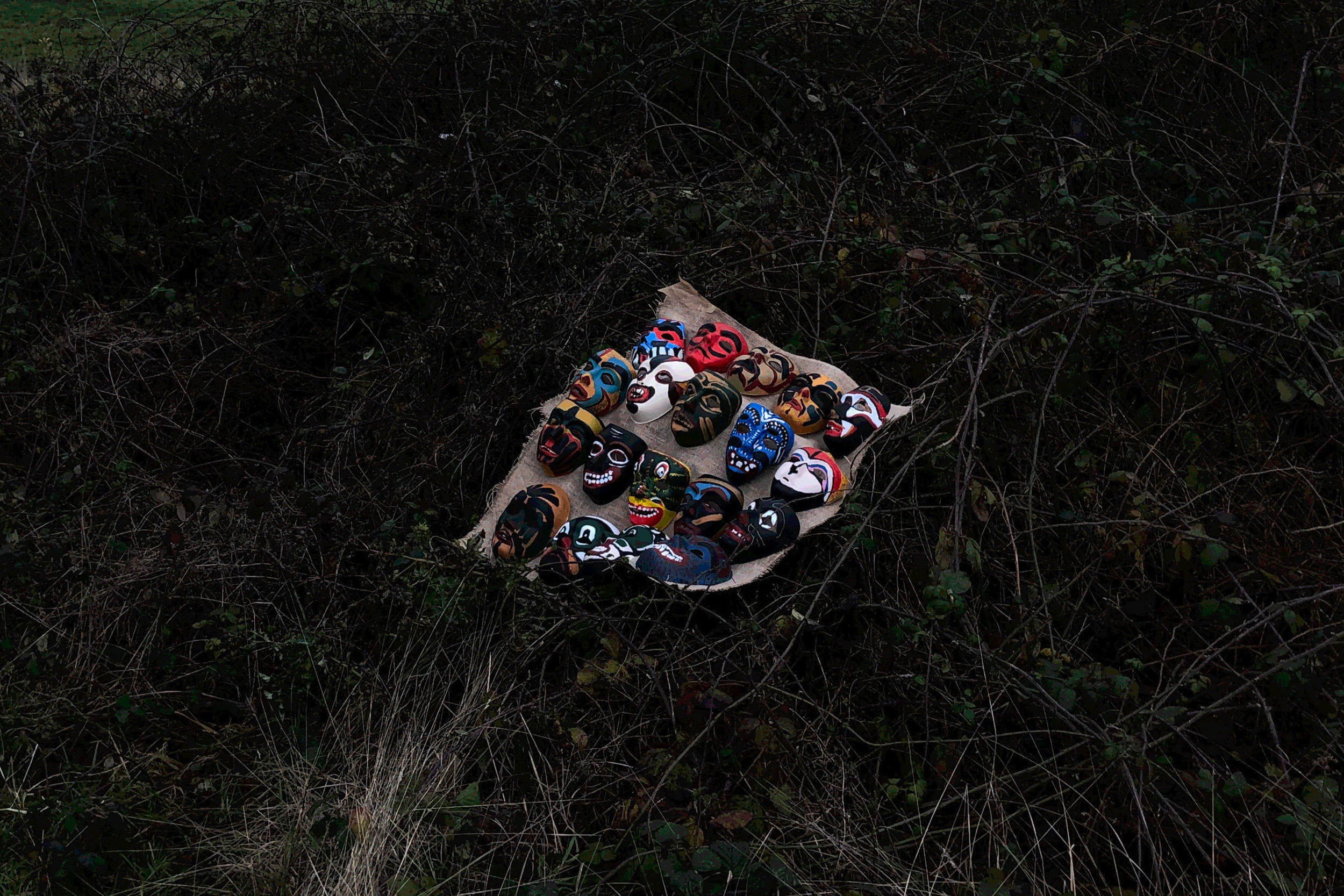
THE KAMA SUTRA [Image Making]


![]()
INTENTIONAL MISTAKES
The idea of ‘Accidents Gallery’ creates a system of making mistakes ‘on purpose’, as a way to encourage the unexpected. To find a balance between something that already exists and something unexpected. In the end, the system of rules that can be used or created to invite accidents into a positive role, and the outcome produced by the system becomes something beyond oneself. As a result, to encourage the unpredictable.
The works within the ‘Accidents Gallery’ were inspired by the approach of the Dadaist poem, think of these invented systems as something which
encourages a kind of ‘self-less’ creative process.
THE INTENTIONAL ERROR [Risograph]
PITT RIVERS MUSEUM EMPATHY DESIGN
(USER: 9-year-old introverted home-school student)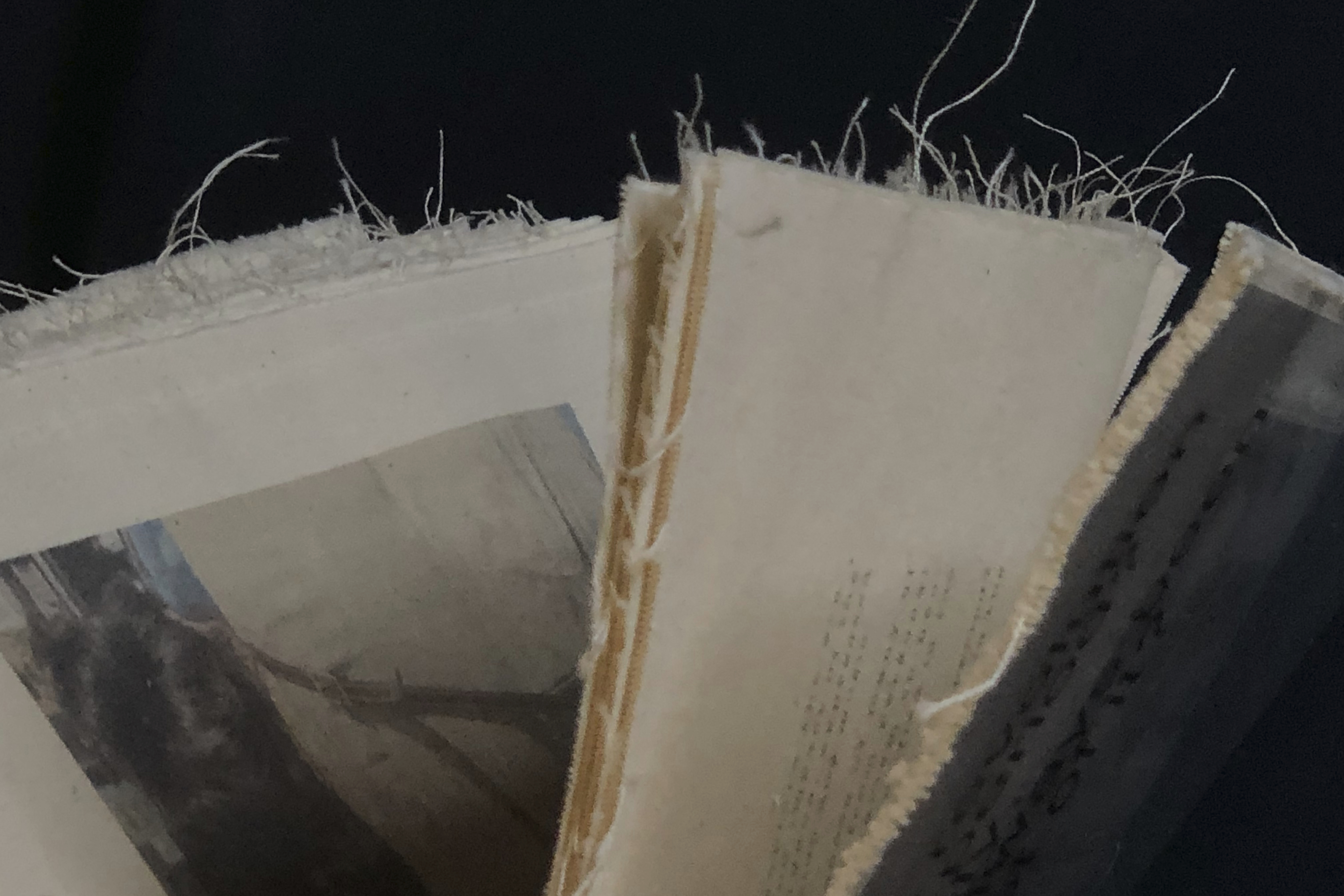
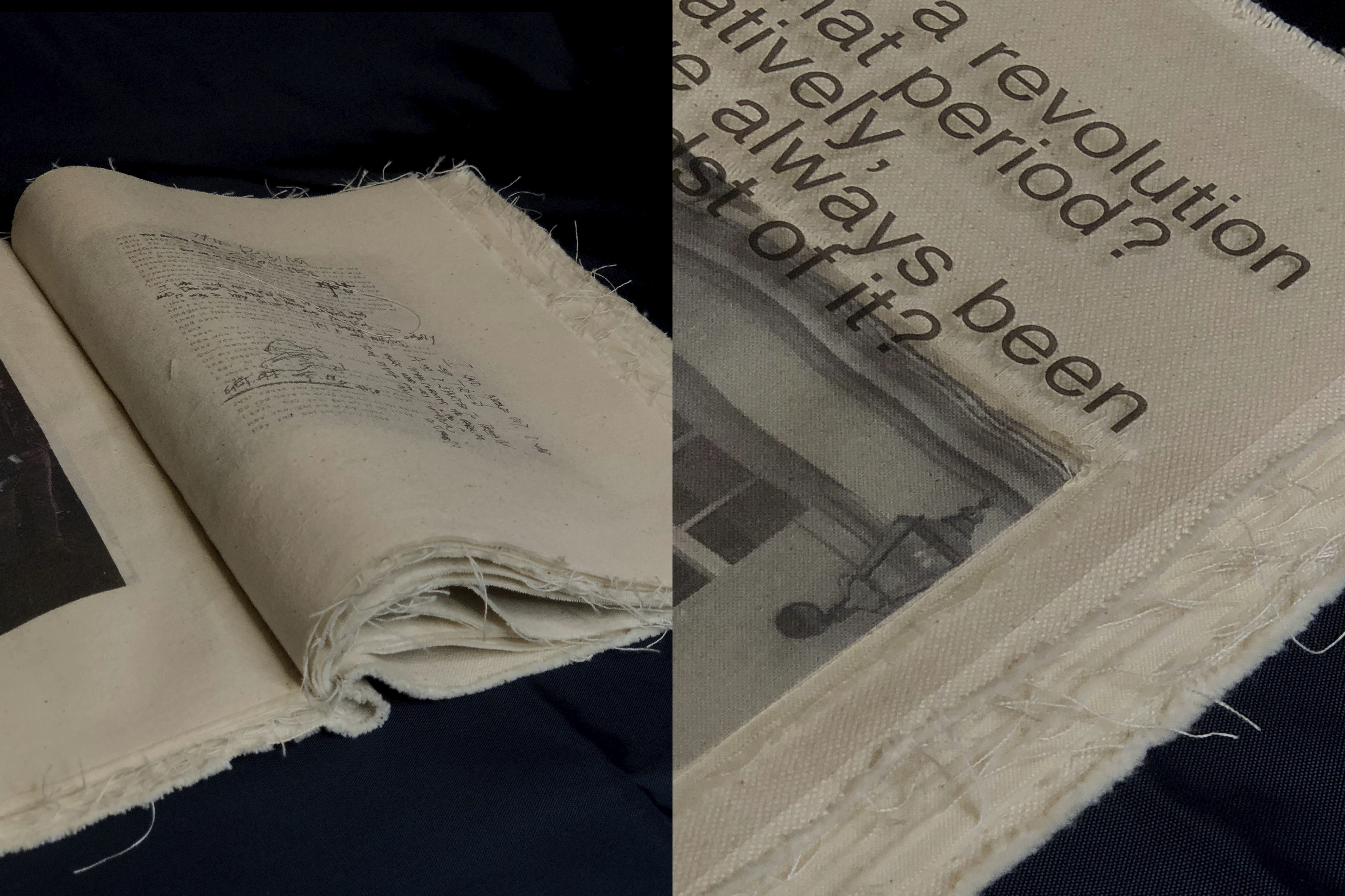
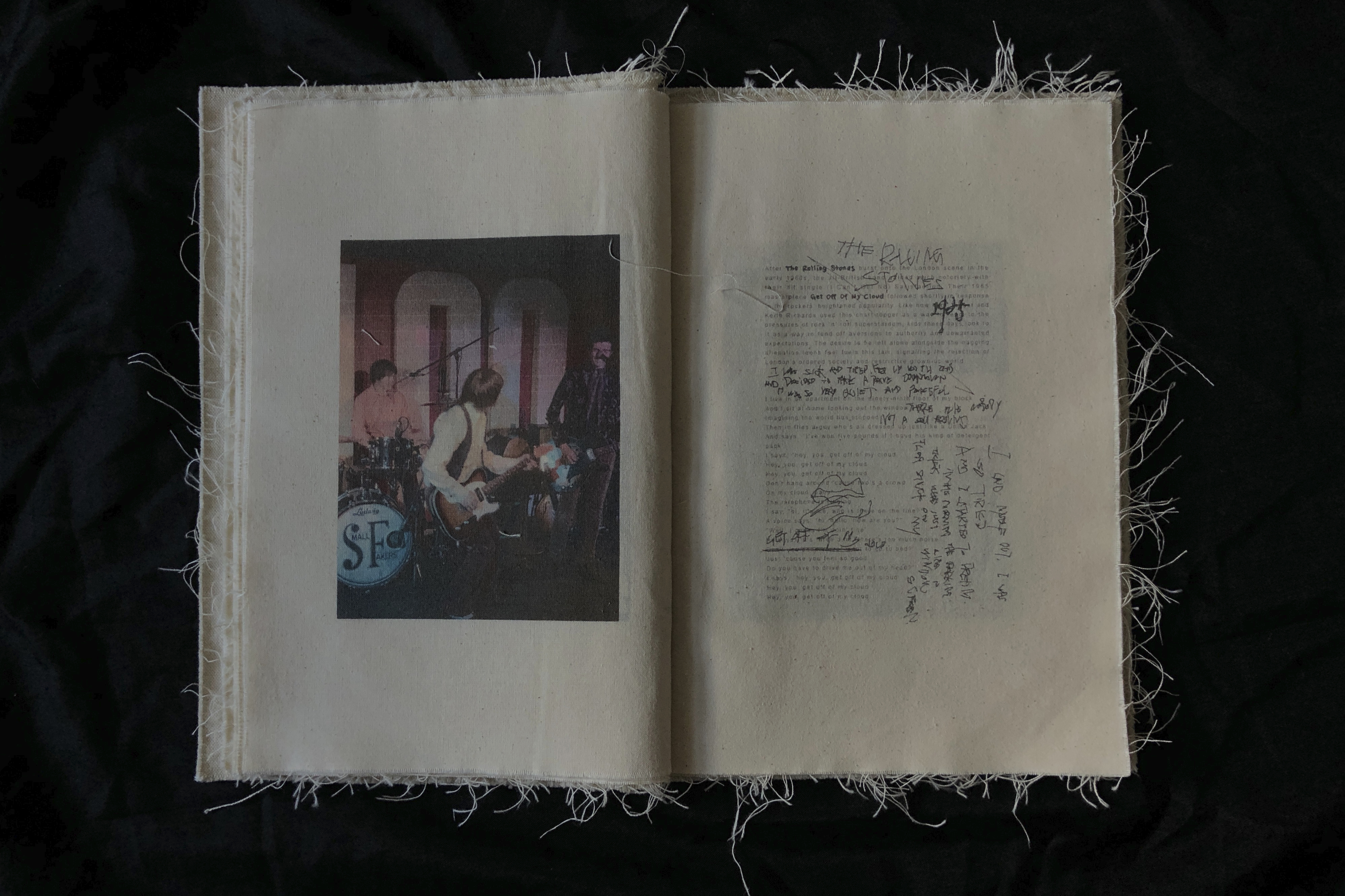
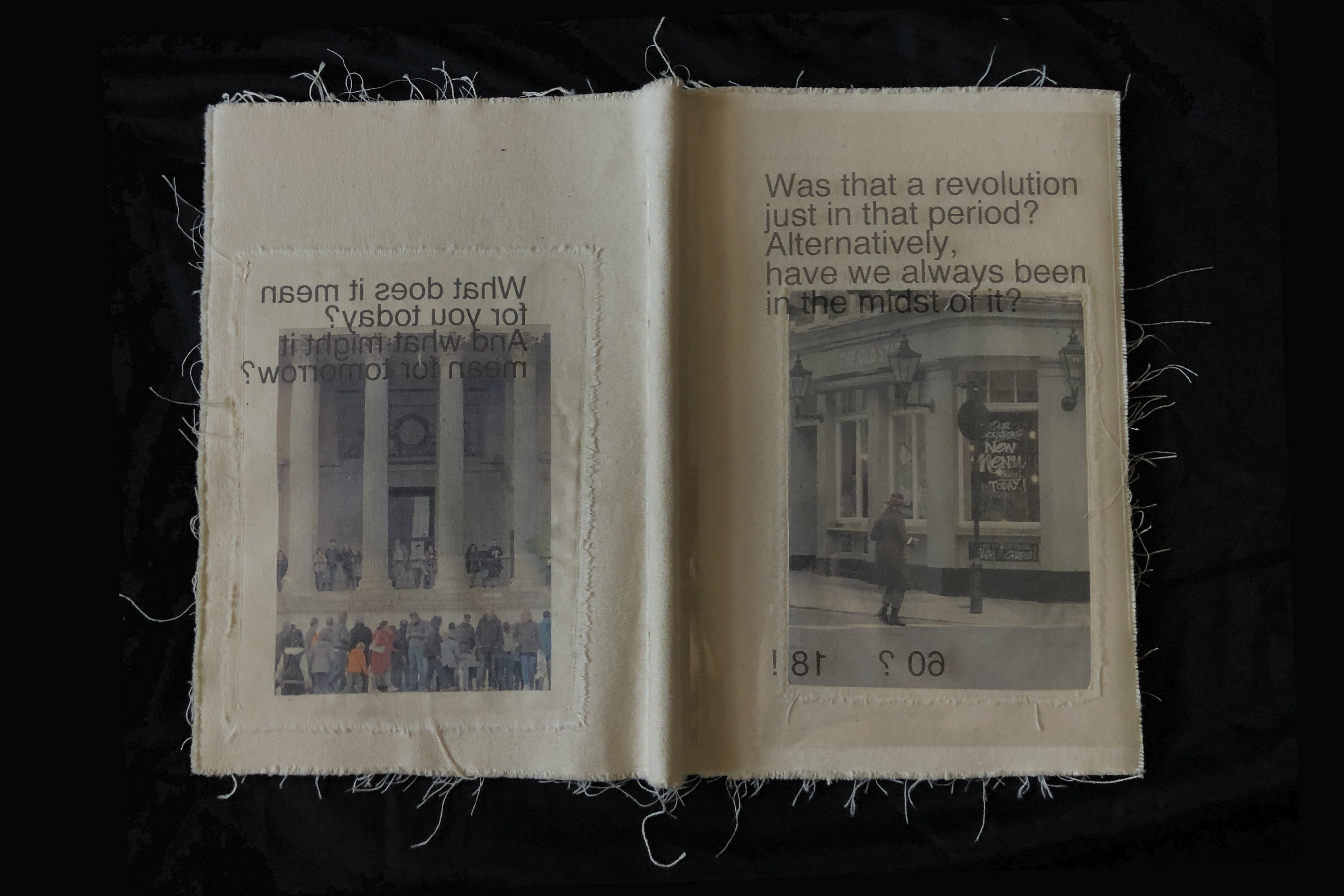
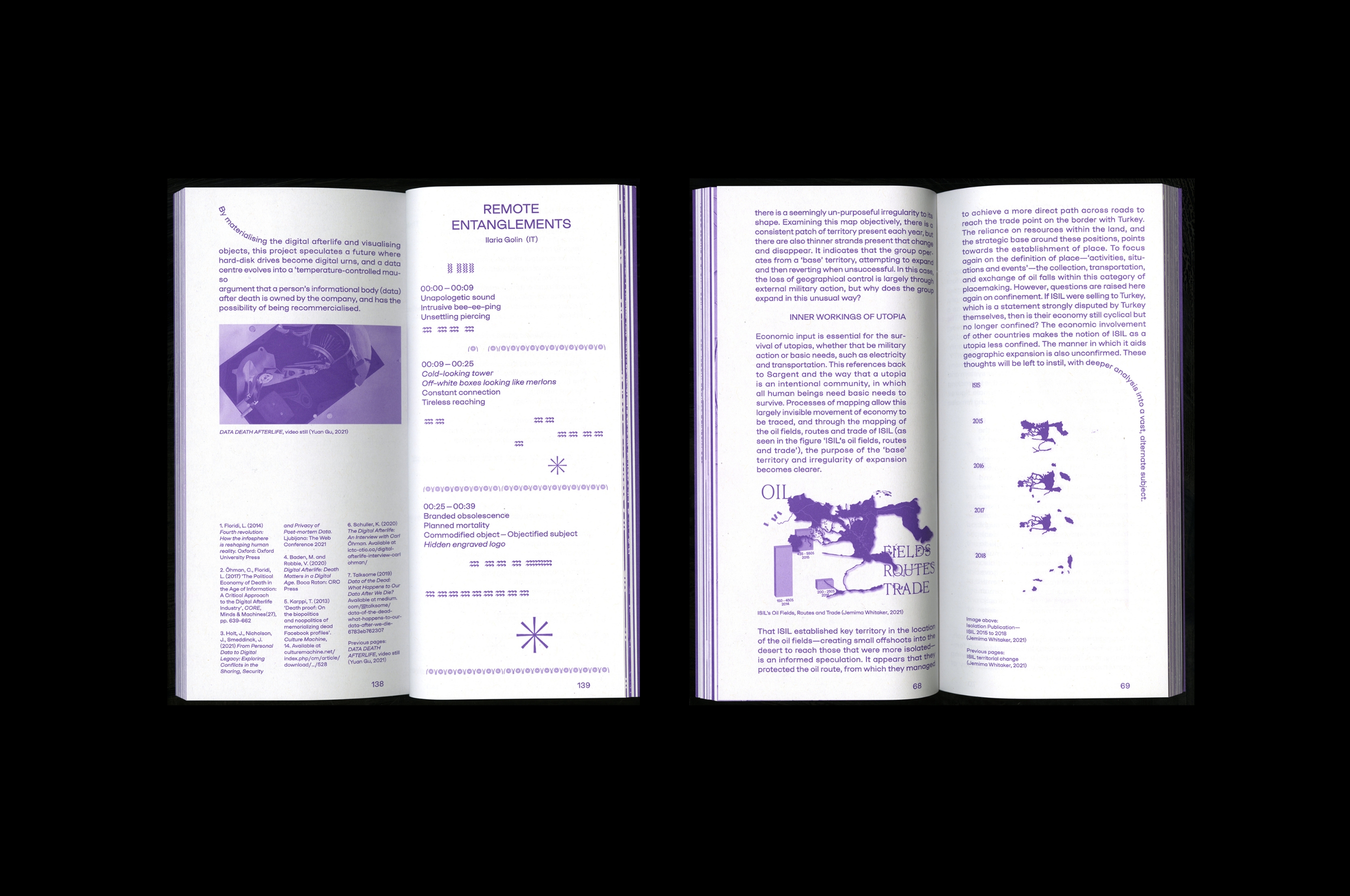
A REVOLUTION LOOP
Through the expression of vintage clothing and music, a fabric book explores the era-defining significance and impact of the revolution in London in the late 1960s. Looking back, the 1960s may also be used to pinpoint the origins of many of the major issues of today, such as neo-liberalism, anti-consumerism, and personal identity. Was that a revolution just in that period? Or, have we always been in the midst of it? 1960s? 2010s!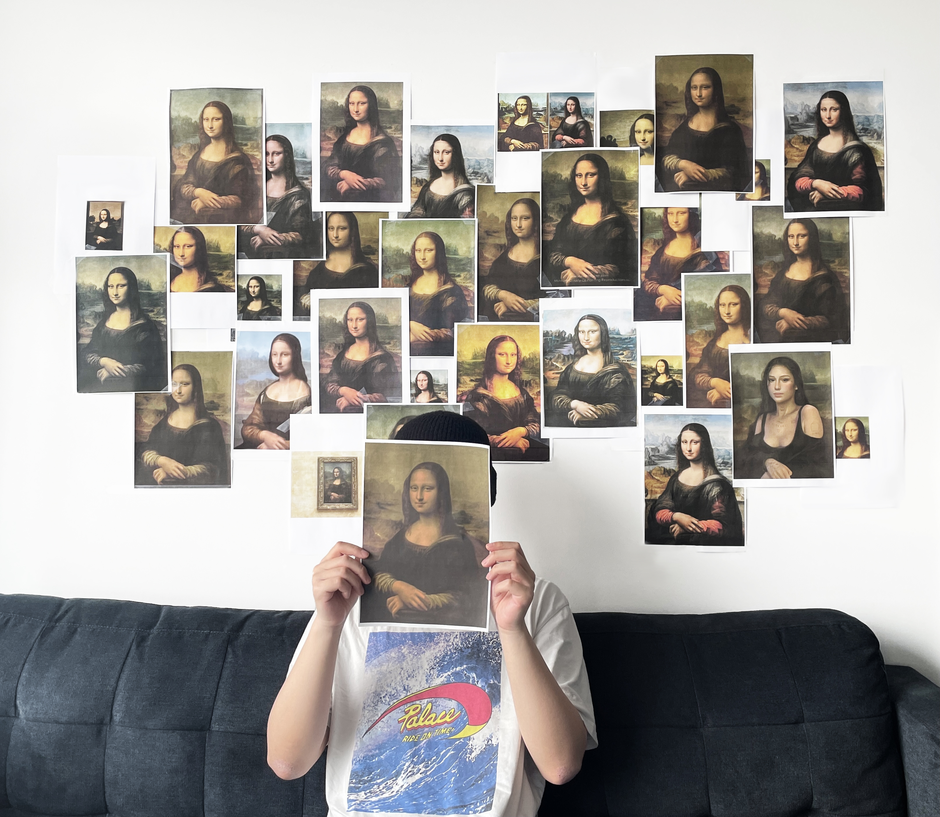
MONA LISA IN 2020S
![]()
![]()
![]()
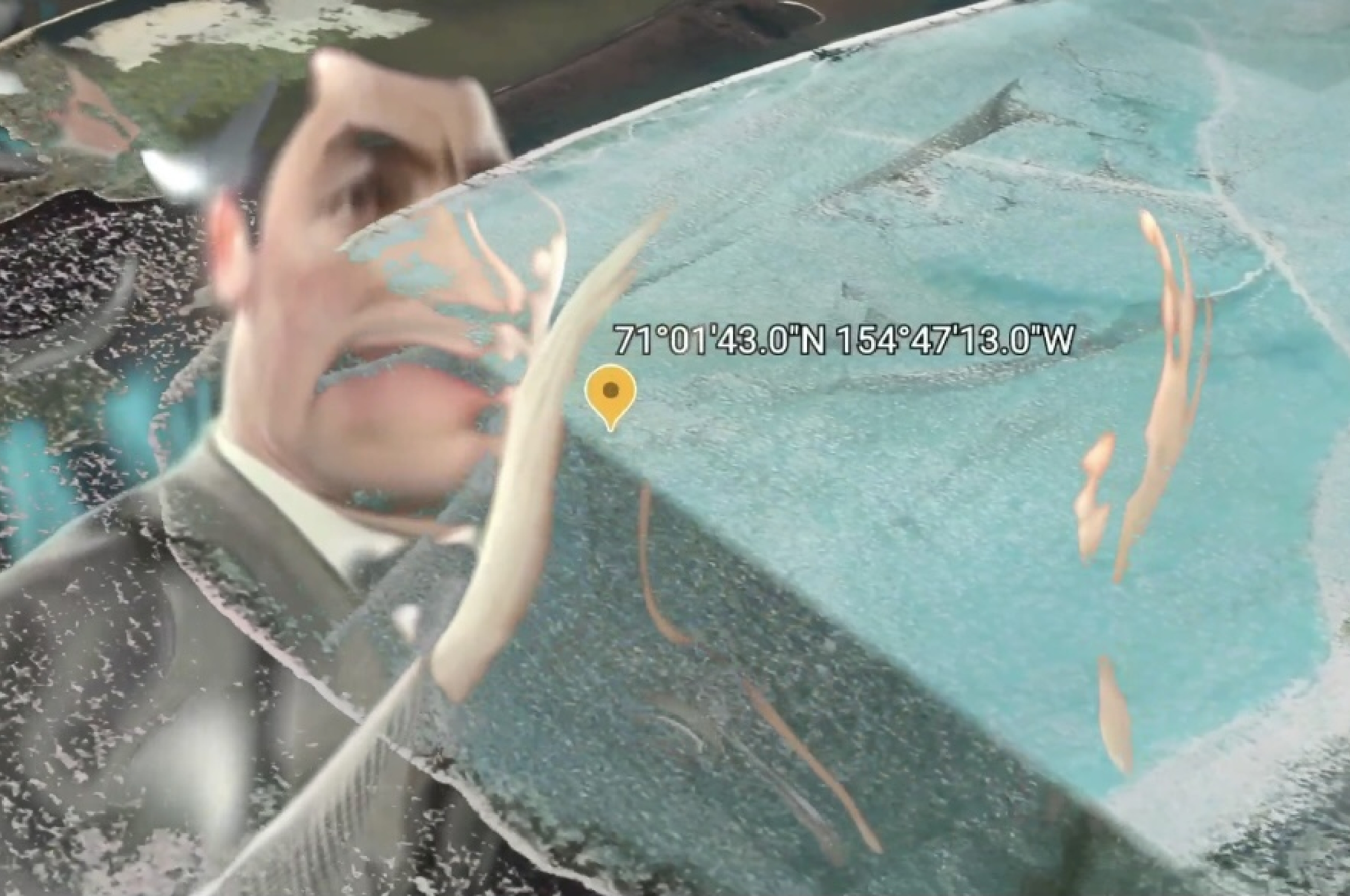
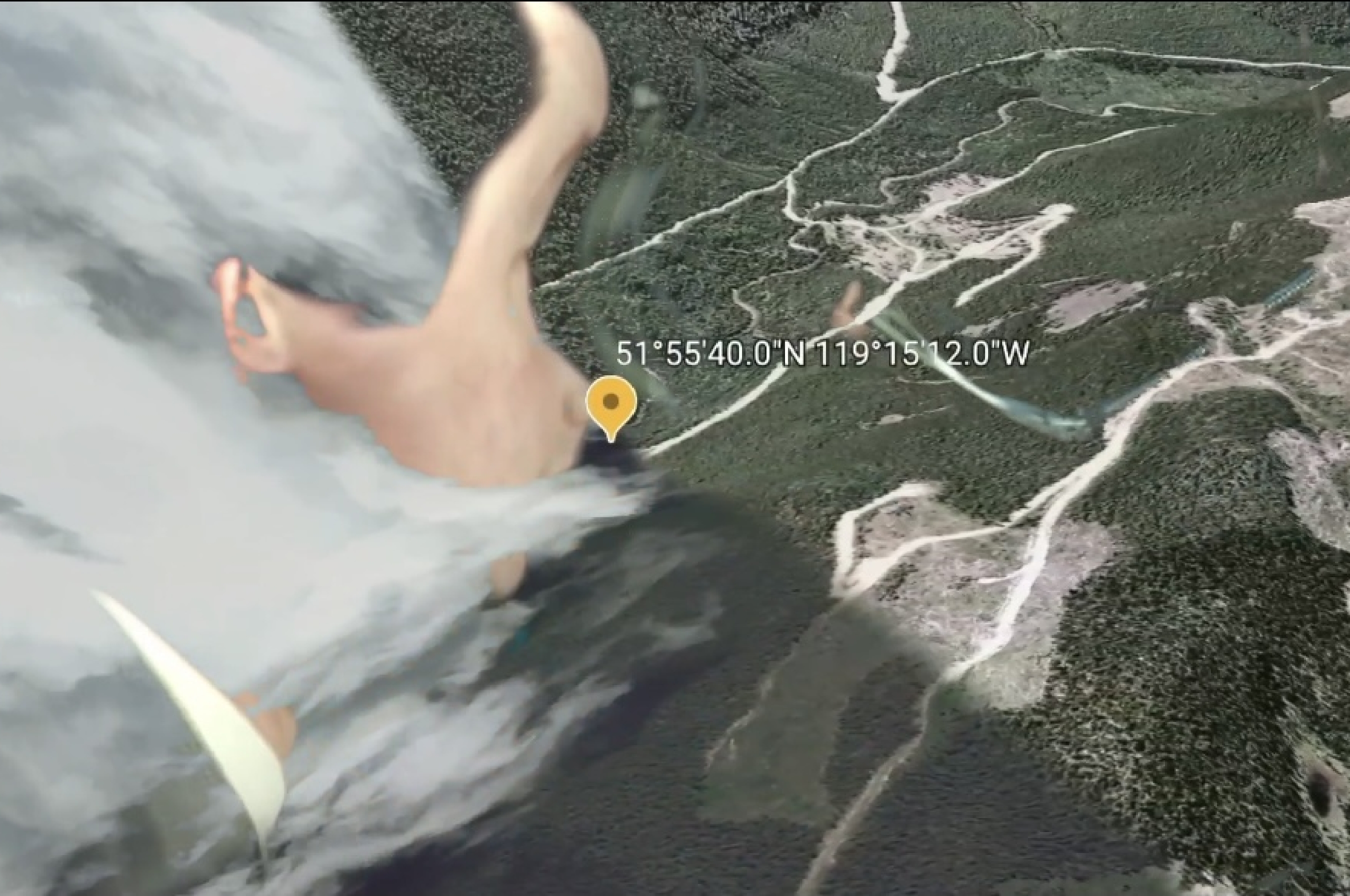
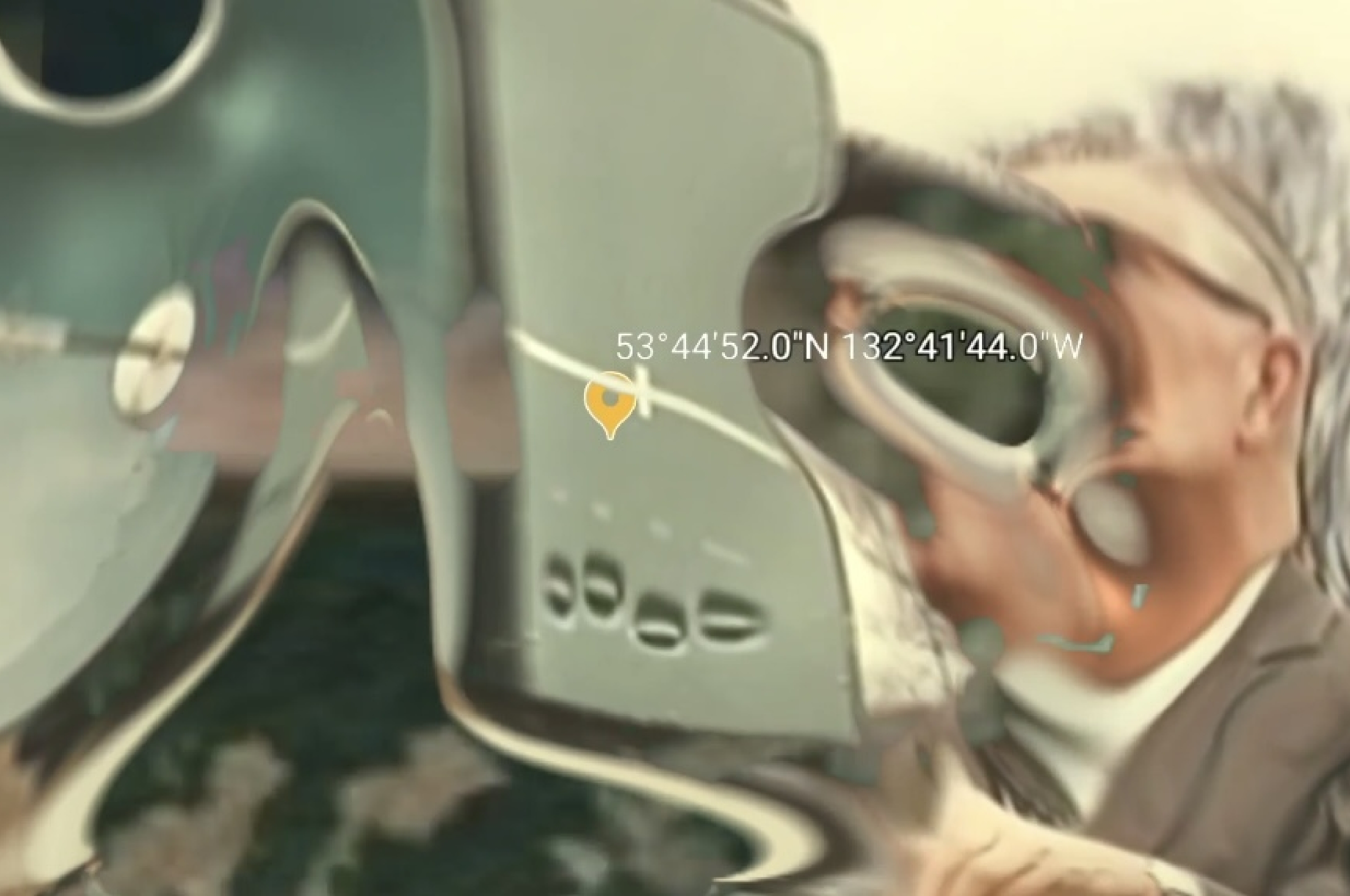
![]() MAP NAVIGATION
MAP NAVIGATION